pacman::p_load(tidyverse, FunnelPlotR, plotly, knitr)Hands-on Exercise 4d - Funnel Plots for Fair Comparisons
1 About this Exercise
In this exercise, we will learn how to plot the following:
funnel plots using funnelPlotR package,
static funnel plot using ggplot2 package, and
interactive funnel plot using both plotly R and ggplot2 packages.
2 What is Funnel Plot?
Funnel plot is a specially designed data visualisation for conducting unbiased comparison between outlets, stores or business entities.
The term ‘funnel plot’ refers to the fact that the precision of the estimated intervention effect increases with the size of the study. Small study effect estimates will typically scatter more widely at the bottom of the graph, with the spread narrowing among larger studies as they are more precise and closer to the true effect.
More details here.
3 Getting Started
Before we start, let us ensure that the required R packages have been installed and import the relevant data for this hands-on exercise.
3.1 Installing and Loading the Packages
For this exercise, other than tidyverse, we will use the following packages:
readr for importing csv into R.
FunnelPlotR for creating funnel plot.
ggplot2 for creating funnel plot manually.
knitr for building static html table.
plotly for creating interactive funnel plot.
3.2 Importing Data
In this exercise, COVID-19_DKI_Jakarta will be used. The data was downloaded from Open Data Covid-19 Provinsi DKI Jakarta portal.
We will use this data to compare the cumulative COVID-19 cases and deaths by sub-districts as at 31 Jul 2021, DKI Jakarta.
The following code chunk imports the data into R and save it as a tibble dataframe object called covid19.
covid19 <- read_csv("data/COVID-19_DKI_Jakarta.csv") %>%
  mutate_if(is.character, as.factor)
4 Using FunnelPlotR
4.1 About FunnelPlotR
FunnelPlotR package uses ggplot to generate funnel plots. It requires a numerator (events of interest), denominator (population to be considered) and group. The key arguments selected for customisation are:
limit: plot limits (95 or 99).label_outliers: to label outliers (true or false).Poisson_limits: to add Poisson limits to the plot.OD_adjust: to add overdispersed limits to the plot.xrangeandyrange: to specify the range to display for axes, acts like a zoom function.Other aesthetic components such as graph title, axis labels etc
4.2 Basic Plot
funnel_plot(
  numerator = covid19$Positive,
  denominator = covid19$Death,
  group = covid19$`Sub-district`,
  title = "COVID-19 Cases and Deaths \nby Sub-Districts in Jakarta (31 Jul 2021)"
)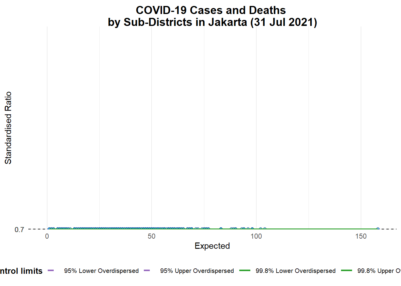
A funnel plot object with 267 points of which 0 are outliers.
Plot is adjusted for overdispersion.
Note
group in this function is dfferent from the scatterplot. Here, it defines the level of the points to be plotted i.e. Sub-district, District or City. If Cityc is chosen, there are only six data points.
By default, data_type argument is “SR”.
limit: Plot limits, accepted values are: 95 or 99, corresponding to 95% or 99.8% quantiles of the distribution.
But the above chart is not easy to read because all the dots are close to each other.
So we will change the data_type from “SR” to “PR” (proportions) and add xrange and yrange to set the range of x-axis and y-axis.
funnel_plot(
  numerator = covid19$Death,
  denominator = covid19$Positive,
  group = covid19$`Sub-district`,
  data_type = "PR",
  xrange = c(0, 6500),
  yrange = c(0, 0.05)
)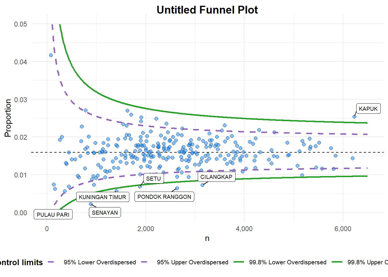
A funnel plot object with 267 points of which 7 are outliers.
Plot is adjusted for overdispersion.
We can further ehnance the chart by adding title and axis labels, and removing the point labels to avoid overly cluttering the chart.
funnel_plot(
  numerator = covid19$Death,
  denominator = covid19$Positive,
  group = covid19$`Sub-district`,
  data_type = "PR",
  xrange = c(0, 6500),
  yrange = c(0, 0.05),
  label = NA,
  title = "Cumulative COVID-19 Fatality Rate by \nCumulative Total Number of COVID-19 Positive Cases", #<<
  x_label = "Cumulative COVID-19 Positive Cases", #<<
  y_label = "Cumulative Fatality Rate"  #<<
)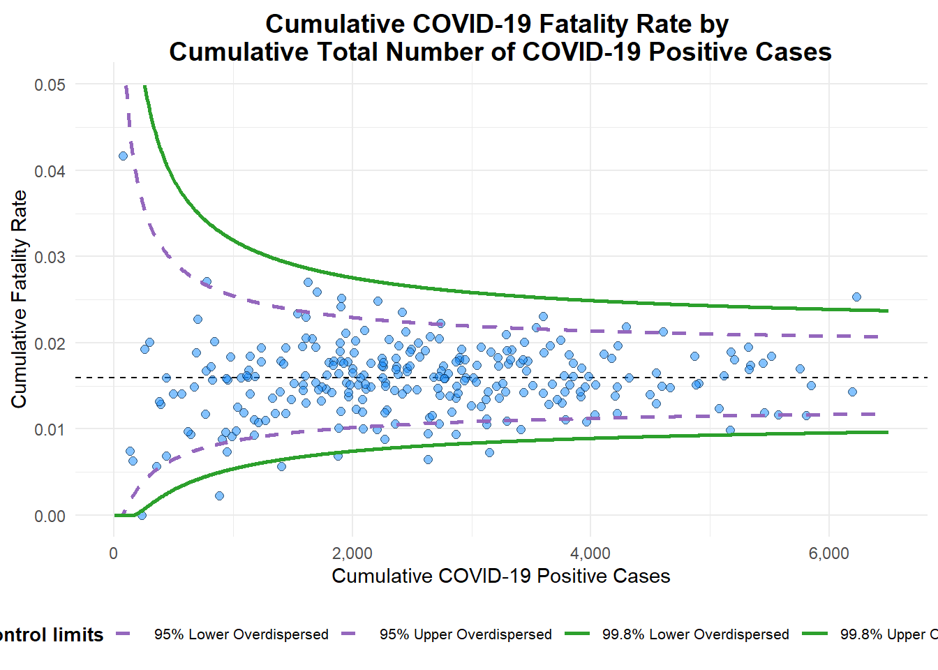
A funnel plot object with 267 points of which 7 are outliers.
Plot is adjusted for overdispersion.
5 Using ggplot2
We can also use ggplot2 to create funnel plots! It will require more steps (as compared to FunnelPlotR) but it can also allow us to customise our charts at very granular levels.
5.1 Computing Basic Derived Fields
To plot the funnel plot from scratch, we need to calculate the death rate and the standard error of cumulative death rate.
df <- covid19 %>%
  mutate(rate = Death / Positive) %>%
  mutate(rate.se = sqrt((rate*(1-rate)) / (Positive))) %>%
  filter(rate > 0)
Then we compute the fit.mean using the following code chunk.
fit.mean <- weighted.mean(df$rate, 1/df$rate.se^2)5.2 Computing Upper and Lower Limits for 95% and 99% Confiedence Intervals
The following code chun computes the upper and lowr limits for 95% and 99% Confidence Intervals.
number.seq <- seq(1, max(df$Positive), 1)
number.ll95 <- fit.mean - 1.96 * sqrt((fit.mean*(1-fit.mean)) / (number.seq))
number.ul95 <- fit.mean + 1.96 * sqrt((fit.mean*(1-fit.mean)) / (number.seq))
number.ll999 <- fit.mean - 3.29 * sqrt((fit.mean*(1-fit.mean)) / (number.seq))
number.ul999 <- fit.mean + 3.29 * sqrt((fit.mean*(1-fit.mean)) / (number.seq))
dfCI <- data.frame(number.ll95, number.ul95, number.ll999,
                   number.ul999, number.seq, fit.mean)
5.3 Static Funnel Plot
Now we are ready to start plotting!
We can create a static funnel plot using a combination of geom_point and geom_line functions, as seen in the following code chunk.
p <- ggplot(df, aes(x = Positive, y = rate)) +
  geom_point(aes(label=`Sub-district`),
             alpha=0.4) +
  geom_line(data = dfCI,
            aes(x = number.seq,
                y = number.ll95),
            size = 0.4,
            colour = "grey40",
            linetype = "dashed") +
  geom_line(data = dfCI,
            aes(x = number.seq,
                y = number.ul95),
            size = 0.4,
            colour = "grey40",
            linetype = "dashed") +
  geom_line(data = dfCI,
            aes(x = number.seq,
                y = number.ll999),
            size = 0.4,
            colour = "grey40") +
  geom_line(data = dfCI,
            aes(x = number.seq,
                y = number.ul999),
            size = 0.4,
            colour = "grey40") +
  geom_hline(data = dfCI,
             aes(yintercept = fit.mean),
             size = 0.4,
             colour = "grey40") +
  coord_cartesian(ylim=c(0,0.05)) +
  annotate("text", x = 1, y = -0.13, label = "95%", size = 3, colour = "grey40") +
  annotate("text", x = 4.5, y = -0.18, label = "99%", size = 3, colour = "grey40") +
  ggtitle("Cumulative Fatality Rate by Cumulative Number of COVID-19 Cases") +
  xlab("Cumulative Number of COVID-19 Cases") +
  ylab("Cumulative Fatality Rate") +
  theme_light() +
  theme(plot.title = element_text(size=12),
        legend.position = c(0.91,0.85),
        legend.title = element_text(size=7),
        legend.text = element_text(size=7),
        legend.background = element_rect(colour = "grey60", linetype = "dotted"),
        legend.key.height = unit(0.3, "cm"))

p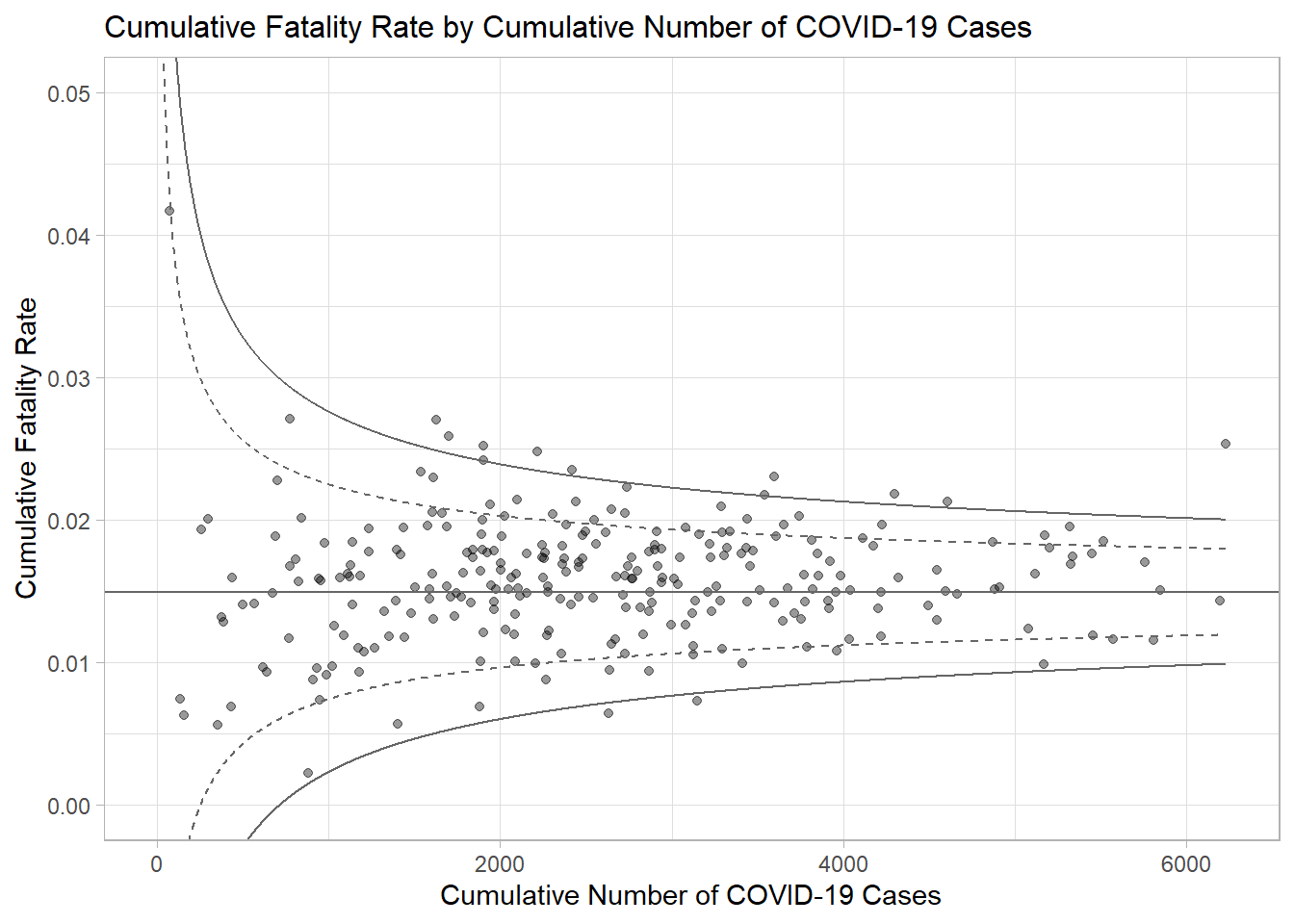
5.4 Interactive Funnel Plot
We can make the funnel plot interactive using ggplotly() of plotly r package.
fp_ggplotly <- ggplotly(p,
  tooltip = c("label",
              "x",
              "y"))
fp_ggplotly
6 References
- Kam, T. S. (2023). R for Visual Analytics [Web-book]. https://r4va.netlify.app/.