pacman::p_load(tidyverse, ggHoriPlot, ggthemes)In-class Exercise 2: Horizon Plot
1 Getting Started
First, let us ensure that the required R packages have been installed and import the relevant data for this hands-on exercise.
1.1 Installing the R Packages
For this in-class exercise, we will be using the following packages:
The code chunk below uses p_load() of pacman package to check if the packages are installed in the computer. If they are, they will be launched in R. Otherwise, pacman will install the relevant packages before launching them.
1.2 Importing the Data
We will use read_csv() to import the csv file into R and use glimpse() to check the imported data.
averp <- read_csv("data/AVERP.csv")
glimpse(averp)
Rows: 7,452
Columns: 3
$ Date <chr> "1/1/2014", "1/2/2014", "1/3/2014", "1/4/2014", "1/5/…
$ `Consumer Items` <chr> "Wholemeal Bread (Per 400 Gram)", "Wholemeal Bread (P…
$ Values <dbl> 2.05, 2.05, 2.04, 2.04, 2.05, 2.05, 2.05, 2.05, 2.04,…From the above output, we noted that the Date field was read as character data type. We will use Lubriate package to change the Date field to Date data type.
averp <- averp %>%
  mutate(Date = dmy(Date)) %>%
  rename(ConsumerItem = `Consumer Items`)
glimpse(averp)
Rows: 7,452
Columns: 3
$ Date <date> 2014-01-01, 2014-02-01, 2014-03-01, 2014-04-01, 2014-05-…
$ ConsumerItem <chr> "Wholemeal Bread (Per 400 Gram)", "Wholemeal Bread (Per 4…
$ Values <dbl> 2.05, 2.05, 2.04, 2.04, 2.05, 2.05, 2.05, 2.05, 2.04, 2.0…2 Plotting Horizon Plot
We will plot out data from 2018-01-01 onwards by filtering the Date field from averp datatable. To plot the horizon plot, we will use geom_horizon() and facet_grid(). Then we will add theme using theme_few() from ggthemes, customise a diverging colour scheme using scale_fill_hcl().
averp %>%
  filter(Date >= "2018-01-01") %>%
  ggplot() +
  geom_horizon(aes(x = Date, y= Values),
               origin = "midpoint",
               horizonscale = 6) +
  facet_grid(ConsumerItem~.) +
  theme_few() +
  scale_fill_hcl(palette = 'RdBu') +
  theme(panel.spacing.y=unit(0, "lines"), strip.text.y = element_text(
    size = 5, angle = 0, hjust = 0),
    legend.position = 'none',
    axis.text.y = element_blank(),
    axis.text.x = element_text(size=7),
    axis.title.y = element_blank(),
    axis.title.x = element_blank(),
    axis.ticks.y = element_blank(),
    panel.border = element_blank()
    ) +
    scale_x_date(expand=c(0,0), date_breaks = "3 month", date_labels = "%b%y") +
  ggtitle('Average Retail Prices of Selected Consumer Items (Jan 2018 to Dec 2022)')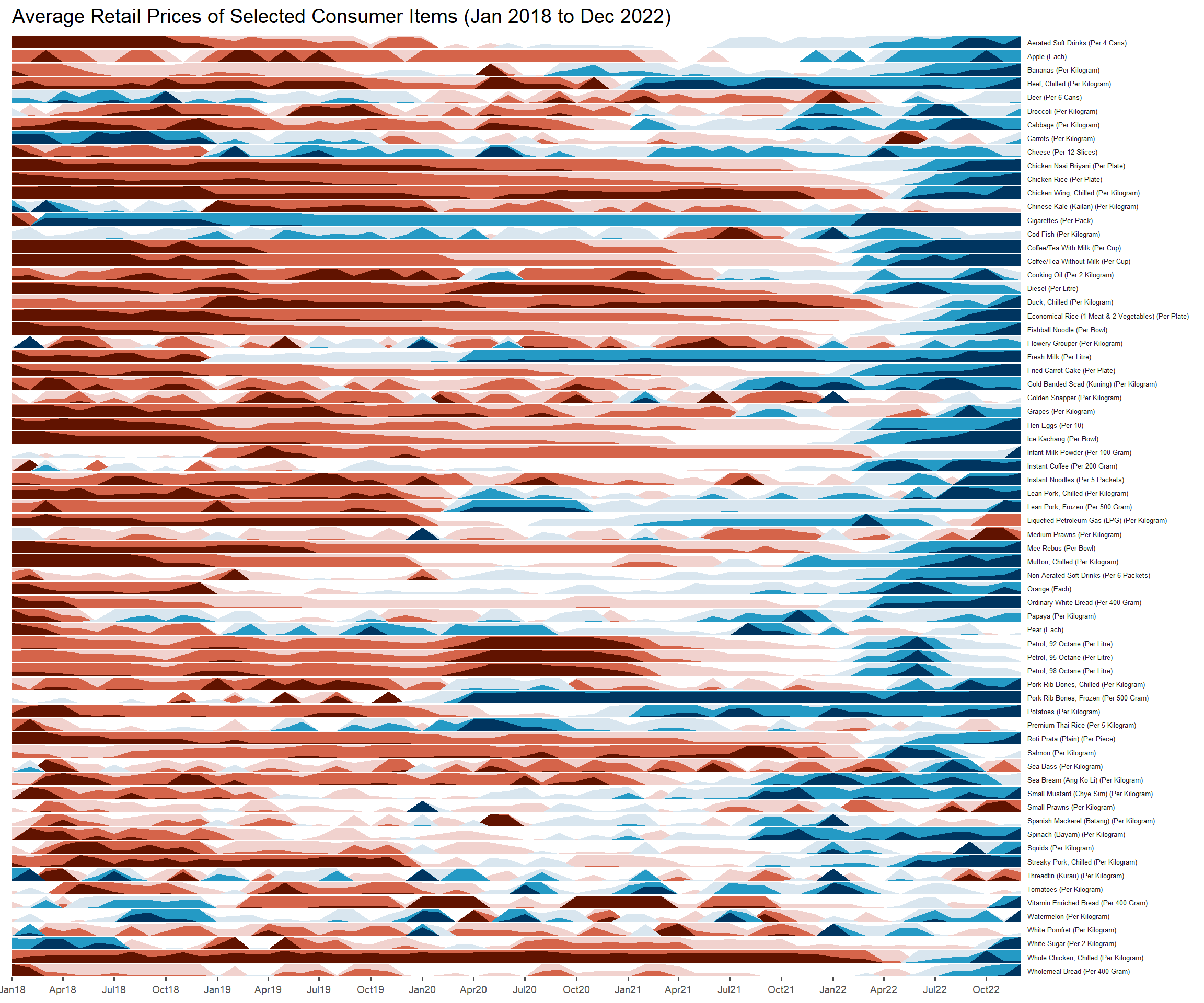
Tips!
If there are positive and negative values, use a diverging colour scheme
Tried using hrbrthemes instead of ggthemes to beautify the horizon plot but it didn’t work out well :(
Some useful arguments used in the above code chunk:
panel.spacing.y: to adjust spacing between facet panels along the y-axis
strip.text.y: to adjust the vertical facet labels
scale_x_date: to override the default scale for dates along the x-axis.