Show the code
pacman::p_load(tidyverse, sf, tmap)In this exercise, we will learn how to plot functional and truthful choropleth maps using tmap package.
Choropleth mapping involves the symbolisation of enumeration units, such as countries, provinces, states, counties or census units, using area patterns or graduated colors. For example, a social scientist may need to use a choropleth map to portray the spatial distribution of aged population of Singapore by Master Plan 2014 Subzone Boundary.
For this exercise, other than tmap, we will use the following packages:
Among the four packages, readr, tidyr and dplyr are part of tidyverse package.So, we only need to install tidyverse instead of readr, tidyr and dplyr individually.
pacman::p_load(tidyverse, sf, tmap)For this exercise, we will use two datasets to create the choropleth map:
Geospatial Data: Master Plan 2014 Subzone Boundary (Web) in ESRI shapefile format (MP14_SUBZONE_WEB_PL). It can be downloaded at data.gov.sg.This dataset contains the geographical boundary of Singapore at the planning subzone level. The data is based on URA Master Plan 2014.
Aspatial Data: Singapore Residents by Planning Area/Subzone, Age Group, Sex and Type of Dwelling, June 2011-2020 in csv format (respopagesextod2011to2020.csv). It can be downloaded from Department of Statistics, Singapore. Although it does not contain any coordinates values, but it’s PA and SZ fields can be used as unique identifiers to geocode to MP14_SUBZONE_WEB_PL shapefile.
The code chunk below uses the st_read() function of sf package to import MP14_SUBZONE_WEB_PL shapefile into R as a simple feature data frame called mpsz.
mpsz <- st_read(dsn = "data/geospatial",
                layer = "MP14_SUBZONE_WEB_PL")
Reading layer `MP14_SUBZONE_WEB_PL' from data source
`C:\sihuihui\VAA\Hands-on_Ex\Hands-on_Ex07\data\geospatial'
using driver `ESRI Shapefile'
Simple feature collection with 323 features and 15 fields
Geometry type: MULTIPOLYGON
Dimension: XY
Bounding box: xmin: 2667.538 ymin: 15748.72 xmax: 56396.44 ymax: 50256.33
Projected CRS: SVY21mpszSimple feature collection with 323 features and 15 fields
Geometry type: MULTIPOLYGON
Dimension: XY
Bounding box: xmin: 2667.538 ymin: 15748.72 xmax: 56396.44 ymax: 50256.33
Projected CRS: SVY21
First 10 features:
OBJECTID SUBZONE_NO SUBZONE_N SUBZONE_C CA_IND PLN_AREA_N
1 1 1 MARINA SOUTH MSSZ01 Y MARINA SOUTH
2 2 1 PEARL'S HILL OTSZ01 Y OUTRAM
3 3 3 BOAT QUAY SRSZ03 Y SINGAPORE RIVER
4 4 8 HENDERSON HILL BMSZ08 N BUKIT MERAH
5 5 3 REDHILL BMSZ03 N BUKIT MERAH
6 6 7 ALEXANDRA HILL BMSZ07 N BUKIT MERAH
7 7 9 BUKIT HO SWEE BMSZ09 N BUKIT MERAH
8 8 2 CLARKE QUAY SRSZ02 Y SINGAPORE RIVER
9 9 13 PASIR PANJANG 1 QTSZ13 N QUEENSTOWN
10 10 7 QUEENSWAY QTSZ07 N QUEENSTOWN
PLN_AREA_C REGION_N REGION_C INC_CRC FMEL_UPD_D X_ADDR
1 MS CENTRAL REGION CR 5ED7EB253F99252E 2014-12-05 31595.84
2 OT CENTRAL REGION CR 8C7149B9EB32EEFC 2014-12-05 28679.06
3 SR CENTRAL REGION CR C35FEFF02B13E0E5 2014-12-05 29654.96
4 BM CENTRAL REGION CR 3775D82C5DDBEFBD 2014-12-05 26782.83
5 BM CENTRAL REGION CR 85D9ABEF0A40678F 2014-12-05 26201.96
6 BM CENTRAL REGION CR 9D286521EF5E3B59 2014-12-05 25358.82
7 BM CENTRAL REGION CR 7839A8577144EFE2 2014-12-05 27680.06
8 SR CENTRAL REGION CR 48661DC0FBA09F7A 2014-12-05 29253.21
9 QT CENTRAL REGION CR 1F721290C421BFAB 2014-12-05 22077.34
10 QT CENTRAL REGION CR 3580D2AFFBEE914C 2014-12-05 24168.31
Y_ADDR SHAPE_Leng SHAPE_Area geometry
1 29220.19 5267.381 1630379.3 MULTIPOLYGON (((31495.56 30...
2 29782.05 3506.107 559816.2 MULTIPOLYGON (((29092.28 30...
3 29974.66 1740.926 160807.5 MULTIPOLYGON (((29932.33 29...
4 29933.77 3313.625 595428.9 MULTIPOLYGON (((27131.28 30...
5 30005.70 2825.594 387429.4 MULTIPOLYGON (((26451.03 30...
6 29991.38 4428.913 1030378.8 MULTIPOLYGON (((25899.7 297...
7 30230.86 3275.312 551732.0 MULTIPOLYGON (((27746.95 30...
8 30222.86 2208.619 290184.7 MULTIPOLYGON (((29351.26 29...
9 29893.78 6571.323 1084792.3 MULTIPOLYGON (((20996.49 30...
10 30104.18 3454.239 631644.3 MULTIPOLYGON (((24472.11 29...The message above also tells us that mpsz’s geometry type is multipolygon, there are a total of 323 multipolygon features and 15 fields in mpsz and it is in svy21 projected coordinates systems.
We will import respopagesextod2011to2020.csv file using read_csv() function of readr package.
popdata <- read_csv("data/aspatial/respopagesextod2011to2020.csv")

head(popdata)
# A tibble: 6 × 7
PA SZ AG Sex TOD Pop Time
<chr> <chr> <chr> <chr> <chr> <dbl> <dbl>
1 Ang Mo Kio Ang Mo Kio Town Centre 0_to_4 Males HDB 1- and 2-Room … 0 2011
2 Ang Mo Kio Ang Mo Kio Town Centre 0_to_4 Males HDB 3-Room Flats 10 2011
3 Ang Mo Kio Ang Mo Kio Town Centre 0_to_4 Males HDB 4-Room Flats 30 2011
4 Ang Mo Kio Ang Mo Kio Town Centre 0_to_4 Males HDB 5-Room and Exe… 50 2011
5 Ang Mo Kio Ang Mo Kio Town Centre 0_to_4 Males HUDC Flats (exclud… 0 2011
6 Ang Mo Kio Ang Mo Kio Town Centre 0_to_4 Males Landed Properties 0 2011From the above output, we see that there are 7 columns in the datatable, namely: Planning area (PA), Subzone (SZ), Age Group (AG), Sex, Type of Dwelling (TOD), Population (Pop), Year (Time).
Before a thematic map can be prepared, we need to prepare a data table with year 2020 values. The data table should include the variables: PA, SZ, YOUNG(AG 0 to 4 until AG 20 to 24), ECONOMY ACTIVE (AG 25 to 29 until AG 60 - 64), AGED (AG 65 and above), TOTAL (All AG), DEPENDENCY (ratio between young and aged against economy active group).
popdata2020 <- popdata %>%
  filter(Time == 2020) %>%
  group_by(PA, SZ, AG) %>%
  summarise(Pop = sum(Pop)) %>%
  ungroup() %>%
  pivot_wider(names_from = AG,
               values_from = Pop)

glimpse(popdata2020)
Rows: 332
Columns: 21
$ PA <chr> "Ang Mo Kio", "Ang Mo Kio", "Ang Mo Kio", "Ang Mo Kio", …
$ SZ <chr> "Ang Mo Kio Town Centre", "Cheng San", "Chong Boon", "Ke…
$ `0_to_4` <dbl> 170, 1060, 850, 680, 210, 560, 200, 670, 0, 160, 0, 740,…
$ `10_to_14` <dbl> 280, 1040, 1020, 960, 400, 640, 390, 930, 0, 210, 0, 119…
$ `15_to_19` <dbl> 340, 1160, 1070, 1010, 450, 700, 460, 830, 0, 260, 0, 13…
$ `20_to_24` <dbl> 270, 1330, 1310, 1170, 500, 860, 590, 890, 0, 300, 0, 14…
$ `25_to_29` <dbl> 260, 1720, 1610, 1410, 500, 970, 680, 1310, 0, 320, 0, 1…
$ `30_to_34` <dbl> 310, 2020, 1890, 1420, 340, 1030, 500, 1410, 0, 240, 0, …
$ `35_to_39` <dbl> 330, 2150, 1720, 1440, 300, 980, 330, 1420, 0, 250, 0, 1…
$ `40_to_44` <dbl> 400, 2080, 1810, 1630, 370, 1010, 430, 1640, 0, 260, 0, …
$ `45_to_49` <dbl> 480, 2200, 1820, 1810, 550, 1190, 580, 1580, 0, 320, 0, …
$ `50_to_54` <dbl> 380, 2050, 1900, 1720, 540, 1200, 580, 1370, 0, 290, 0, …
$ `55_to_59` <dbl> 310, 2130, 2100, 1800, 550, 1390, 660, 1570, 0, 340, 0, …
$ `5_to_9` <dbl> 230, 1050, 850, 800, 320, 570, 300, 870, 0, 180, 0, 950,…
$ `60_to_64` <dbl> 290, 2110, 2150, 1780, 480, 1280, 720, 1650, 0, 390, 0, …
$ `65_to_69` <dbl> 250, 2180, 2100, 1710, 410, 1200, 560, 1530, 0, 270, 0, …
$ `70_to_74` <dbl> 240, 1750, 1800, 1450, 360, 970, 390, 1430, 0, 200, 0, 1…
$ `75_to_79` <dbl> 130, 960, 1120, 830, 230, 630, 210, 890, 0, 120, 0, 650,…
$ `80_to_84` <dbl> 100, 650, 800, 630, 150, 430, 190, 700, 0, 80, 0, 480, 9…
$ `85_to_89` <dbl> 30, 340, 430, 350, 100, 250, 110, 360, 0, 50, 0, 250, 50…
$ `90_and_over` <dbl> 10, 170, 220, 150, 60, 130, 70, 190, 0, 30, 0, 100, 50, …head(popdata2020, 10)# A tibble: 10 × 21
PA SZ `0_to_4` `10_to_14` `15_to_19` `20_to_24` `25_to_29` `30_to_34`
<chr> <chr> <dbl> <dbl> <dbl> <dbl> <dbl> <dbl>
1 Ang Mo… Ang … 170 280 340 270 260 310
2 Ang Mo… Chen… 1060 1040 1160 1330 1720 2020
3 Ang Mo… Chon… 850 1020 1070 1310 1610 1890
4 Ang Mo… Kebu… 680 960 1010 1170 1410 1420
5 Ang Mo… Semb… 210 400 450 500 500 340
6 Ang Mo… Shan… 560 640 700 860 970 1030
7 Ang Mo… Tago… 200 390 460 590 680 500
8 Ang Mo… Town… 670 930 830 890 1310 1410
9 Ang Mo… Yio … 0 0 0 0 0 0
10 Ang Mo… Yio … 160 210 260 300 320 240
# ℹ 13 more variables: `35_to_39` <dbl>, `40_to_44` <dbl>, `45_to_49` <dbl>,
# `50_to_54` <dbl>, `55_to_59` <dbl>, `5_to_9` <dbl>, `60_to_64` <dbl>,
# `65_to_69` <dbl>, `70_to_74` <dbl>, `75_to_79` <dbl>, `80_to_84` <dbl>,
# `85_to_89` <dbl>, `90_and_over` <dbl>Then we will group the various AG to create YOUNG, ECONOMY ACTIVE, AGED, TOTAL and also calculate the ratio DEPENDENCY using mutate() of dplyr package.
popdata2020 <- popdata2020 %>%
  mutate(YOUNG = rowSums(.[3:6]) + rowSums(.[14])) %>%
  mutate(ECONOMYACTIVE = rowSums(.[7:13]) + rowSums(.[15])) %>%
  mutate(AGED = rowSums(.[16:21])) %>%
  mutate(TOTAL = rowSums(.[3:21])) %>%
  mutate(DEPENDENCY = (YOUNG + AGED) / ECONOMYACTIVE) %>%
select(PA, SZ, YOUNG, ECONOMYACTIVE, AGED, TOTAL, DEPENDENCY)head(popdata2020, 10)# A tibble: 10 × 7
PA SZ YOUNG ECONOMYACTIVE AGED TOTAL DEPENDENCY
<chr> <chr> <dbl> <dbl> <dbl> <dbl> <dbl>
1 Ang Mo Kio Ang Mo Kio Town Centre 1290 2760 760 4810 0.743
2 Ang Mo Kio Cheng San 5640 16460 6050 28150 0.710
3 Ang Mo Kio Chong Boon 5100 15000 6470 26570 0.771
4 Ang Mo Kio Kebun Bahru 4620 13010 5120 22750 0.749
5 Ang Mo Kio Sembawang Hills 1880 3630 1310 6820 0.879
6 Ang Mo Kio Shangri-La 3330 9050 3610 15990 0.767
7 Ang Mo Kio Tagore 1940 4480 1530 7950 0.775
8 Ang Mo Kio Townsville 4190 11950 5100 21240 0.777
9 Ang Mo Kio Yio Chu Kang 0 0 0 0 NaN
10 Ang Mo Kio Yio Chu Kang East 1110 2410 750 4270 0.772Before we can perform the georelational join, we need to convert the values in PA and SZ fields to uppercase. This is because the values of PA and SZ fields are made up of upper- and lowercase. On the other, hand the SUBZONE_N and PLN_AREA_N are in uppercase. We will also retain those rows where ECONOMYACTIVE is more than 0 using filter().
popdata2020 <- popdata2020 %>%
  mutate_at(.vars = vars(PA, SZ),
          .funs = funs(toupper)) %>%
  filter(ECONOMYACTIVE > 0)
Then we will use left_join() of dplyr to join the geospatial and aspatial data using planning subzone name (i.e. SUBZONE_N and SZ) as the common identifier.
mpsz_pop2020 <- left_join(mpsz, popdata2020,
by = c("SUBZONE_N" = "SZ"))Note! The mpsz simple feature data frame is the left data table in the left_join. This is to ensure that the output will be a simple features data frame.
Then we will write mpsz_pop2020 into an rds file for easy retrieval in future.
write_rds(mpsz_pop2020, "data/rds/mpszpop2020.rds")Two approaches can be used to prepare thematic map using tmap, they are:
tmap_mode("plot")
qtm(mpsz_pop2020,
    fill = "DEPENDENCY")
tmap_options(check.and.fix = TRUE)
tmap_mode("view")
qtm(mpsz_pop2020, fill = "DEPENDENCY")
Things to learn from the code chunks above:
tmap_mode() with “plot” option is used to produce a static map. For interactive mode, “view” option should be used. fill argument is used to map the attribute (i.e. DEPENDENCY)
The basic building block of tmap is tm_shape() followed by one or more layer elemments such as tm_fill() and tm_polygons().
In the code chunk below, tm_shape() is used to define the input data (i.e mpsz_pop2020) and tm_polygons() is used to draw the planning subzone polygons.
tmap_mode("plot")
tm_shape(mpsz_pop2020) +
  tm_polygons()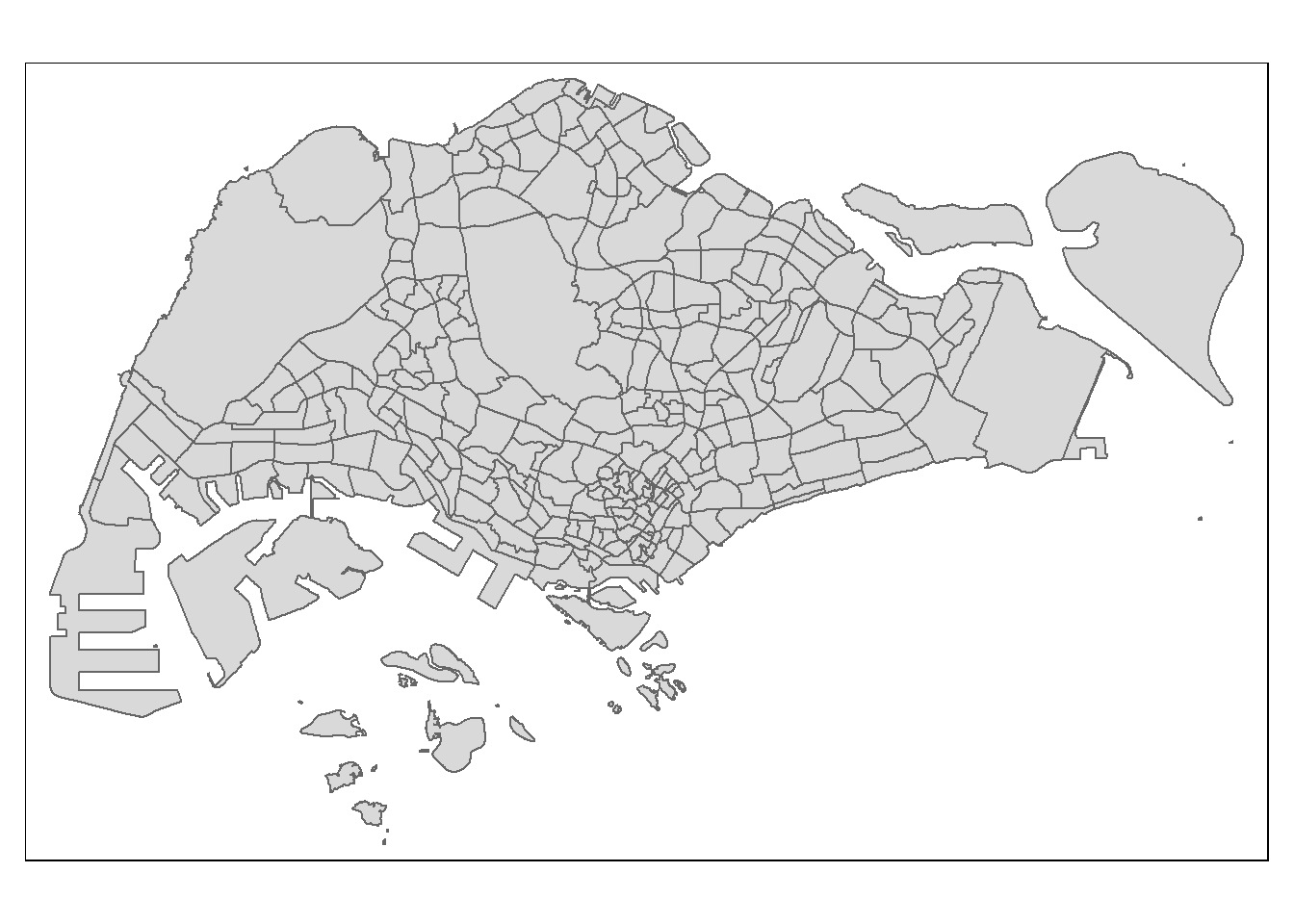
To draw a choropleth map showing the geographical distribution of a selected variable by planning subzone, we need to assign the target variable such as Dependency to tm_polygons().
tm_shape(mpsz_pop2020) +
  tm_polygons("DEPENDENCY")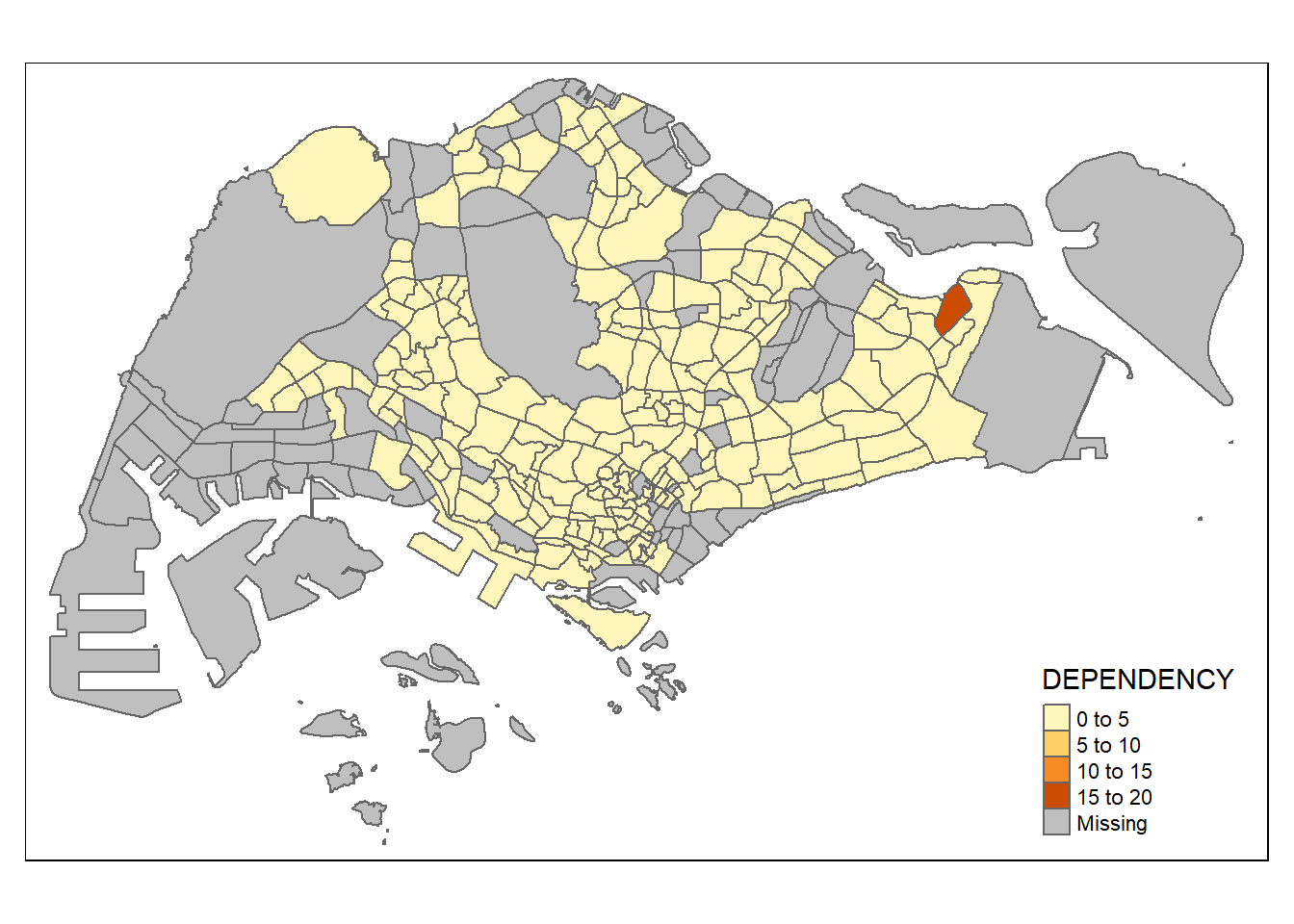
The default interval binning used to draw the choropleth map is called “pretty”. A detailed discussion of the data classification methods supported by tmap will be provided in the following section.
The default colour scheme used is YlOrRd of ColorBrewer. We will learn how to change the colour scheme in the subsequent sections.
By default, missing values will be shaded in grey.
tm_polygons() is a wraper of tm_fill() and tm_border(). tm_fill() shades the polygons by using the default colour scheme and tm_borders() adds the borders of the shapefile onto the choropleth map.
The following code chunk draws a choropleth map using tm_fill() only.
tm_shape(mpsz_pop2020) +
  tm_fill("DEPENDENCY")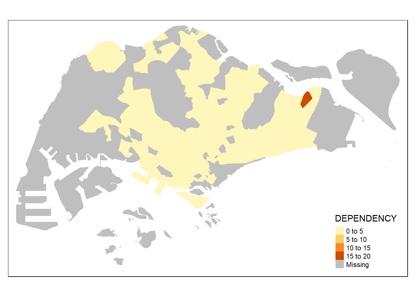
Notice from the above output, there are no borders when only tm_fill() is used.
To add the boundary of the planning subzones, tm_borders() will be used.
tm_shape(mpsz_pop2020) +
  tm_fill("DEPENDENCY") +
  tm_borders(lwd = 0.1, alpha = 1)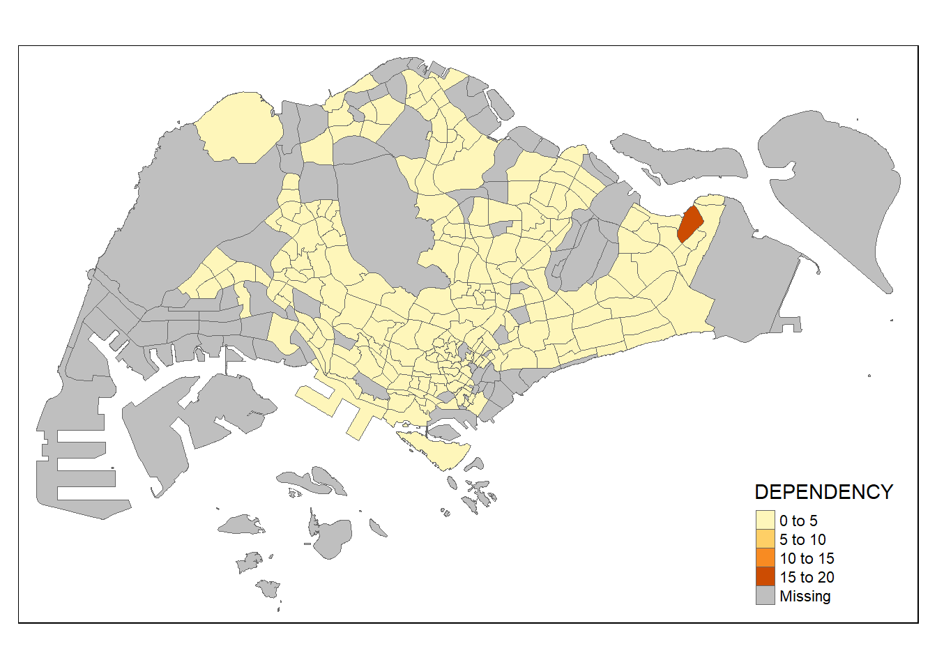
We added light grey border lines on the choropleth map using the above code chunk.
The alpha argument is used to define transparency number between 0 (totally transparent) and 1 (not transparent). By default, the alpha value of the colour used is 1.
There are three other arguments for tm_borders(): - col: border color - lwd: border line width. The default is 1. - lty: border line type. The default is “solid”.
Most choropleth maps employ some methods of data classification. The point of classification is to take a large number of observations and group them into data ranges or classes.
tmap provides a total ten data classification methods, namely: fixed, sd, equal, pretty (default), quantile, kmeans, hclust, bclust, fisher, and jenks.
We can define a data classification method using the style argument of tm_fill() or tm_polygons().
The following code chunk uses jenks data classification. We specify the number of classes to be broken into using n = 5 to group the observations into 5 classes.
tm_shape(mpsz_pop2020) +
  tm_fill("DEPENDENCY",
          n = 5,
          style = "jenks") +
  tm_borders(alpha = 0.5)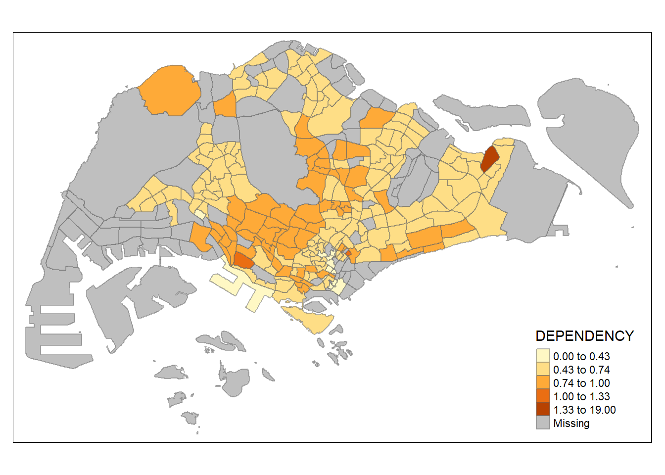
The following code chunk uses equal data classification. We specify the number of classes to be broken into using n = 5 to group the observations into 5 classes.
tm_shape(mpsz_pop2020) +
  tm_fill("DEPENDENCY",
          n = 5,
          style = "equal") +
  tm_borders(alpha = 0.5)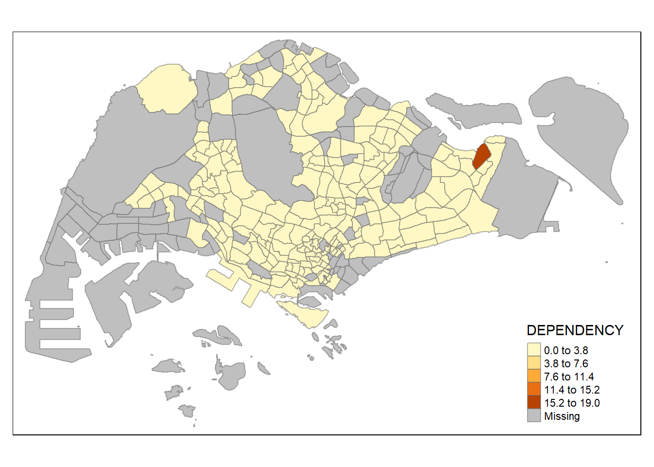
The following code chunk uses quantile data classification. We specify the number of classes to be broken into using n = 5 to group the observations into 5 classes.
tm_shape(mpsz_pop2020) +
  tm_fill("DEPENDENCY",
          n = 5,
          style = "quantile") +
  tm_borders(alpha = 0.5)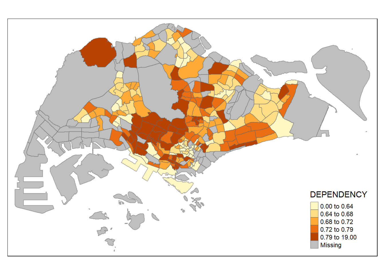
:::{.callout-note} From the above charts, we note that the distribution of different data classification methods lead to different visualisation output. For example, using the equal data classification method, it seemed that most areas had a low ratio except for one area due to it having a very dark shade of orange. In comparison, when the same data uses quantile or jenks data classification methods, the distribution seems more even.
For all the built-in styles, the category breaks are computed internally. In order to override these defaults, the breakpoints can be set explicitly by means of the breaks argument to the tm_fill(). It is important to note that, in tmap the breaks include a minimum and maximum. As a result, in order to end up with n categories, n+1 elements must be specified in the breaks option (the values must be in increasing order).
Before we get started, it is always a good practice to get some descriptive statistics on the variable before setting the break points. Code chunk below will be used to compute and display the descriptive statistics of DEPENDENCY field.
summary(mpsz_pop2020$DEPENDENCY) Min. 1st Qu. Median Mean 3rd Qu. Max. NA's
0.0000 0.6519 0.7025 0.7742 0.7645 19.0000 92 Based on the above results, we set break point at 0.60, 0.70, 0.80, and 0.90. In addition, we also need to include a minimum and maximum, which we set at 0 and 100. Our breaks vector is thus c(0, 0.60, 0.70, 0.80, 0.90, 1.00).
tm_shape(mpsz_pop2020)+
  tm_fill("DEPENDENCY",
          breaks = c(0, 0.60, 0.70, 0.80, 0.90, 1.00)) +
  tm_borders(alpha = 0.5)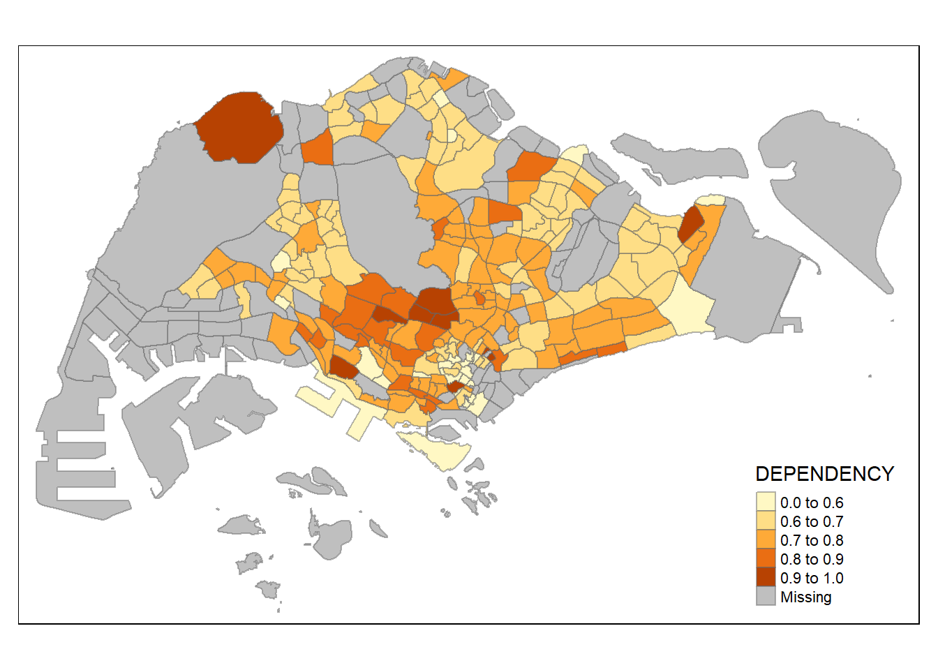
tmap supports colour ramps either defined by the user or a set of predefined colour ramps from the RColorBrewer package.
To change the colour, we assign the preferred colour to palette argument of tm_fill() as shown in the code chunks below.
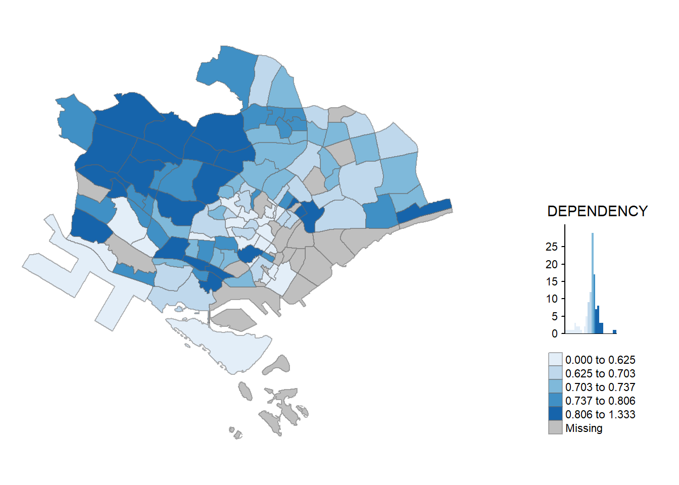
tm_shape(mpsz_pop2020)+
  tm_fill("DEPENDENCY",
          n = 6,
          style = "quantile",
          palette = "Blues") +
  tm_borders(alpha = 0.5)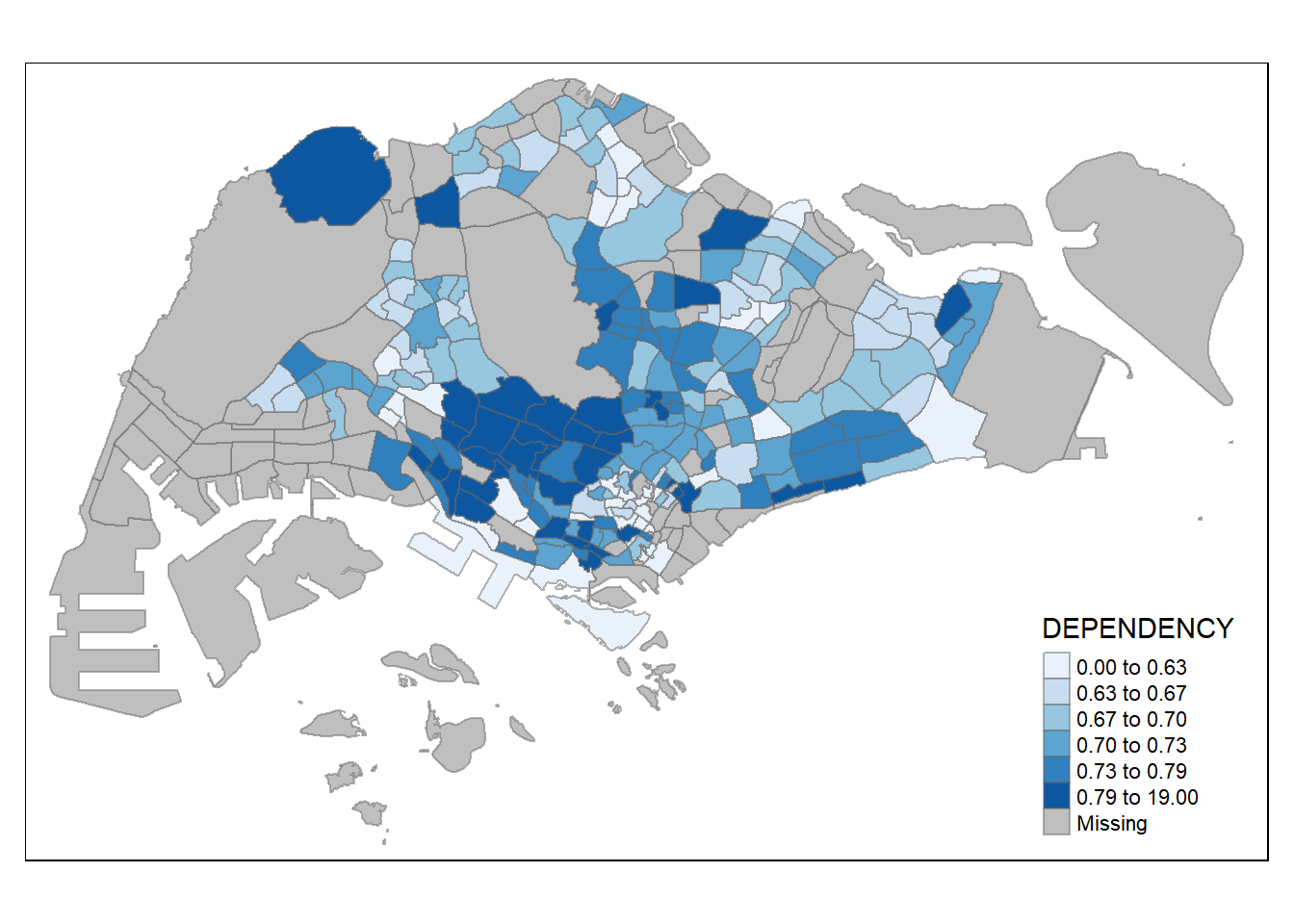
To reverse the colour shading, add a “-” prefix.
tm_shape(mpsz_pop2020)+
  tm_fill("DEPENDENCY",
          style = "quantile",
          palette = "-Reds") +
  tm_borders(alpha = 0.5)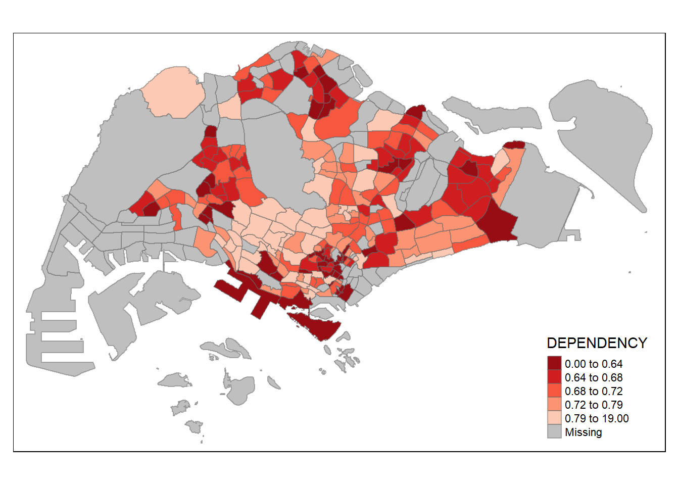
Map layout refers to the combination of all map elements into a cohensive map. Map elements include among others the objects to be mapped, the title, the scale bar, the compass, margins and aspects ratios. Colour settings and data classification methods covered in the previous section relate to the palette and break-points are used to affect how the map looks.
In tmap, several legend options are provided to change the placement, format and appearance of the legend.In the following code chunk, we added a legend histogram using legend.hist = TRUE. adjusted the length height and width using legend.height and legend.width. We also specified the length position using legend.position.
tm_shape(mpsz_pop2020)+
  tm_fill("DEPENDENCY",
          style = "jenks",
          palette = "Greens",
          legend.hist = TRUE,
          legend.is.portrait = TRUE,
          legend.hist.z = 0.1) +
  tm_layout(main.title = "Distribution of Dependency Ratio by planning subzone \n(Jenks classification)",
            main.title.position = "center",
            main.title.size = 1,
            legend.height = 0.45,
            legend.width = 0.35,
            legend.outside = FALSE,
            legend.position = c("right", "bottom"),
            frame = FALSE) +
  tm_borders(alpha = 0.5)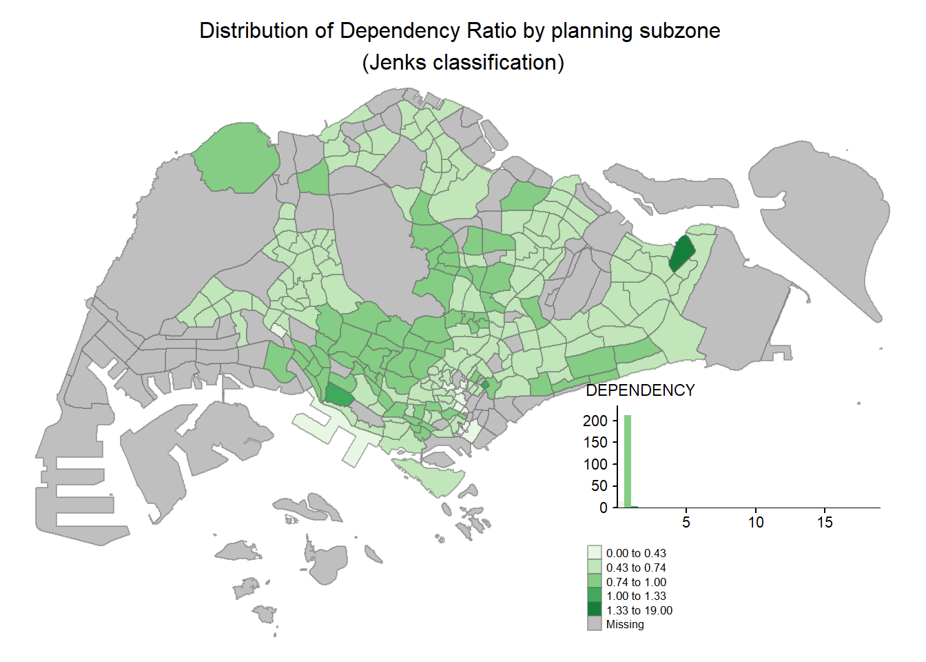
tmap allows a wide variety of layout settings to be changed. They can be called by using tmap_style().
The following map uses the classic style.
tm_shape(mpsz_pop2020)+
  tm_fill("DEPENDENCY",
          style = "quantile",
          palette = "-Greens") +
  tm_borders(alpha = 0.5) +
  tmap_style("classic") +
  tm_layout(main.title = "Distribution of Dependency Ratio by planning subzone \n(Quantile classification)",
            main.title.position = "center",
            main.title.size = 1,
            legend.height = 0.4,
            legend.width = 0.35,)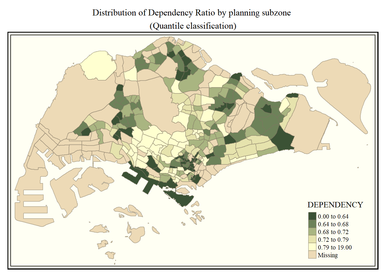
Beside map style, tmap also also provides arguments to draw other map furniture such as compass, scale bar and grid lines.
In the code chunk below, tm_compass(), tm_scale_bar() and tm_grid() are used to add compass, scale bar and grid lines onto the choropleth map.
tm_shape(mpsz_pop2020)+
  tm_fill("DEPENDENCY",
          style = "quantile",
          palette = "Blues",
          title = "No. of persons") +
  tm_layout(main.title = "Distribution of Dependency Ratio \nby planning subzone",
            main.title.position = "center",
            main.title.size = 1,
            legend.height = 0.4,
            legend.width = 0.35,
            frame = TRUE) +
  tm_borders(alpha = 0.5) +
  tm_compass(type="8star", size = 2) +
  tm_scale_bar(width = 0.15) +
  tm_grid(lwd = 0.1, alpha = 0.2) +
  tm_credits("Source: Planning Sub-zone boundary from Urban Redevelopment Authorithy (URA)\n and Population data from Department of Statistics DOS",
             position = c("left", "bottom"))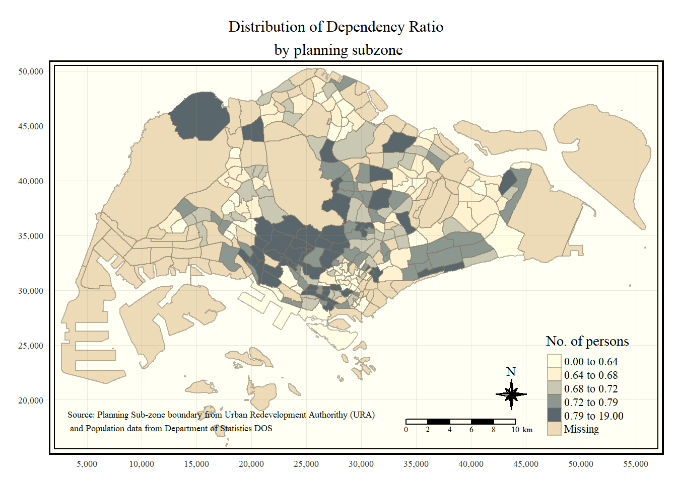
To reset to the default style, we changed the style to white.
tmap_style("white")Small multiple maps, also referred to as facet maps, are composed of many maps arrange side-by-side, and sometimes stacked vertically. Small multiple maps enable the visualisation of how spatial relationships change with respect to another variable, such as time.
In tmap, small multiple maps can be plotted in three ways: - by assigning multiple values to at least one of the asthetic arguments, - by defining a group-by variable in tm_facets(), and - by creating multiple stand-alone maps with tmap_arrange().
In the following code chunk, small multiple choropleth maps are created by defining ncols in tm_fill().
tm_shape(mpsz_pop2020) +
  tm_fill(c("YOUNG", "AGED"),
          style = "equal",
          palette = "Blues") +
  tm_borders(alpha = 0.5) +
  tm_layout(main.title = "Distribution of Young and Old",
            main.title.position = "center",
            main.title.size = 1,
            legend.height = 0.4,
            legend.width = 0.35,
            legend.position = c("right", "bottom"),
            frame = TRUE)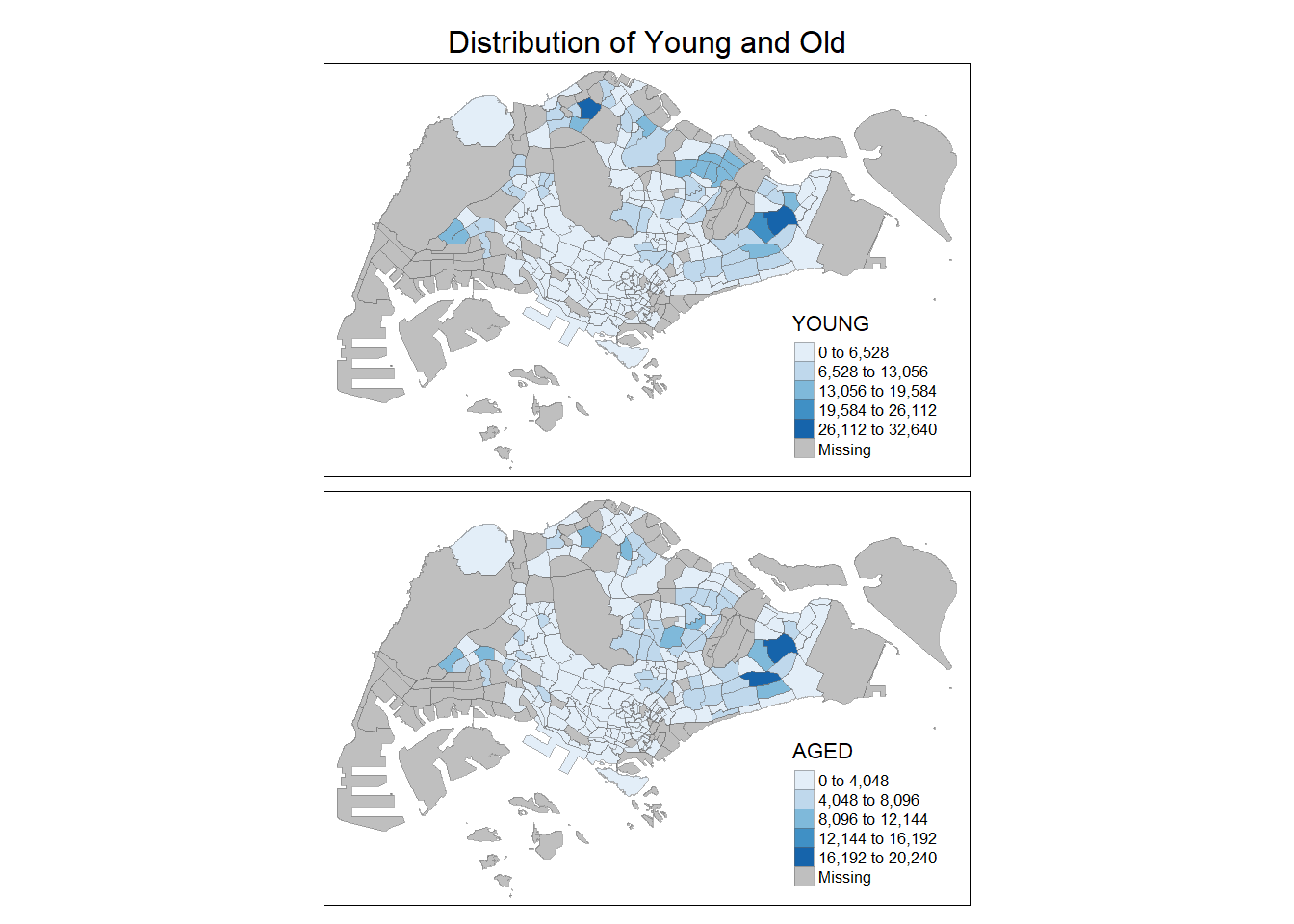
In the following example, multiple choropleth maps are created by assigning multiple values to at least one of the aesthetic arguments. We can also define different data classification and different colour schemes by assigning multiple values.
tm_shape(mpsz_pop2020) +
  tm_polygons(c("DEPENDENCY", "AGED"),
              style = c("equal", "quantile"),
              palette = list("Blues", "Greens")) +
   tm_layout(main.title = "Distribution of Young and Old",
            main.title.position = "center",
            main.title.size = 1,
            legend.height = 0.4,
            legend.width = 0.35,
            legend.position = c("right", "bottom"),
            frame = TRUE)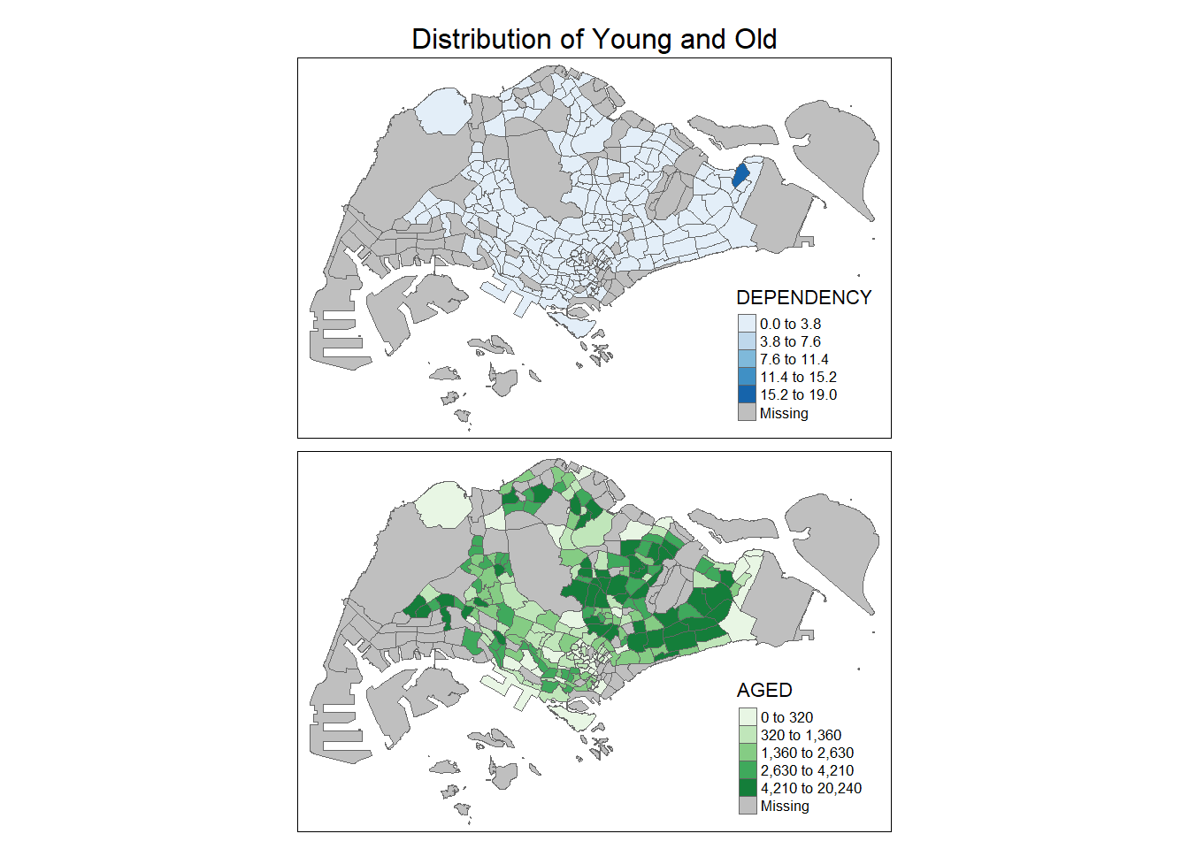
In the following example, multiple choropleth maps are created using tm_facets().
tm_shape(mpsz_pop2020) +
  tm_fill("DEPENDENCY",
          style = "quantile",
          palette = "Greens",
          thres.poly = 0) +
  tm_facets(by="REGION_N",
            free.coords=TRUE,
            drop.shapes=FALSE) +
  tm_layout(main.title = "Dependency Ratio by Regions",
            main.title.size = 1,
            legend.show = FALSE,
            title.position = c("center", "center"),
            title.size = 20) +
  tm_borders(alpha = 0.5) +
  tm_credits("Source: Planning Sub-zone boundary from Urban Redevelopment Authorithy (URA)\n and Population data from Department of Statistics DOS",
             position = c("left", "bottom"))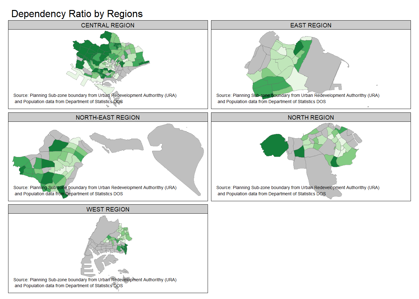
In the following code chunk. multiple choropleth maps are created by first creating multiple stand-alone maps then arranged them together with tmap_arrange(). This is akin to how we use patchwork to arrange several ggplots together.
youngmap <- tm_shape(mpsz_pop2020) +
  tm_polygons("YOUNG",
              style = "quantile",
              palette = "Reds") +
   tm_layout(legend.height = 0.4,
            legend.width = 0.35,
            legend.position = c("right", "bottom"),
            frame = TRUE)


agedmap <- tm_shape(mpsz_pop2020) +
  tm_polygons("AGED",
              style = "quantile",
              palette = "Reds") +
   tm_layout(legend.height = 0.4,
            legend.width = 0.35,
            legend.position = c("right", "bottom"),
            frame = TRUE)

tmap_arrange(youngmap, agedmap, asp = 1, ncol = 2)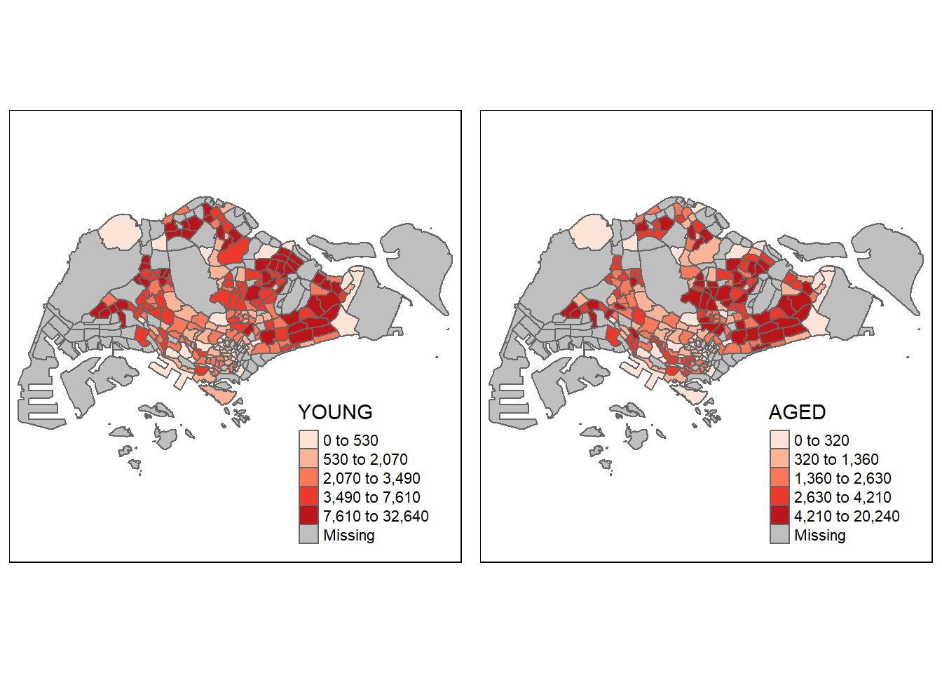
Instead of creating small multiple choropleth map, you can also use selection function to map spatial objects meeting the selection criterion.
In the following code chunk, we define the selection using tm_shape(mpsz_pop2020[mpsz_pop2020$REGION_N=="CENTRAL REGION", ]) to only plot out the Central Region and its dependency ratio.
tm_shape(mpsz_pop2020[mpsz_pop2020$REGION_N=="CENTRAL REGION", ])+
  tm_fill("DEPENDENCY",
          style = "quantile",
          palette = "Blues",
          legend.hist = TRUE,
          legend.is.portrait = TRUE,
          legend.hist.z = 0.1) +
  tm_layout(legend.outside = TRUE,
            legend.height = 0.45,
            legend.width = 5.0,
            legend.position = c("right", "bottom"),
            frame = FALSE) +
  tm_borders(alpha = 0.5)