Show the code
pacman::p_load(tidyverse, ggdist, plotly, gganimate, DT, crosstalk, ggstatsplot, nortest, ggiraph, hrbrthemes)According to Ministry of Sustainability and the Environment, the daily mean temperature is projected to increase by 1.4 to 4.6 Degree Celsius by the end of the century.
In this take-home exercise, I will be using the visual analytics techniques learnt in ISSS 608 to visualise uncertainty methods and create interactive visual analytics to validate the projection if the daily mean temperature is increasing from 1983 to 2023.
First, let us ensure that the required R packages have been installed and import the relevant data for this exercise.
For this exercise, we will be using the following packages:
tidyverse : to load the core tidyverse packages, which includes ggplot2 and dplyr.
ggdis: provides stats and geoms for visualising distributions and uncertainty.
ggiraph: to make interactive ggplot2 plots
plotly: to plot interactive statistical graphs
DT: to create interactive tables using the JavaScript library DataTables
crosstalk: to implement cross-widget interactions
ggstatsplot:an extension of ggplot2 package for creating graphics with details from statistical tests included in the information-rich plots themselves.
nortest: to test the normality assumption.
The code chunk below uses p_load() of pacman package to check if the abovementioned packages are installed in the computer. If they are, they will be launched in R. Otherwise, pacman will install the relevant packages before launching them.
pacman::p_load(tidyverse, ggdist, plotly, gganimate, DT, crosstalk, ggstatsplot, nortest, ggiraph, hrbrthemes)For this exercise, we will be using the historical daily temperature data from Meteorological Service Singapore. As there are more than 60 weather stations in Singapore, for the purpose of this exercise, we will be using the temperature data from Changi weather station in August 1983, 1993, 2003, 2013 and 2023.
aug1983 <- read_csv("data/DAILYDATA_S24_198308.csv")
head(aug1983,10)
# A tibble: 10 × 13
Station Year Month Day `Daily Rainfall Total (mm)` Highest 30 Min Rainfa…¹
<chr> <dbl> <dbl> <dbl> <dbl> <lgl>
1 Changi 1983 8 1 0 NA
2 Changi 1983 8 2 6.4 NA
3 Changi 1983 8 3 2.8 NA
4 Changi 1983 8 4 3.7 NA
5 Changi 1983 8 5 18.7 NA
6 Changi 1983 8 6 0 NA
7 Changi 1983 8 7 0 NA
8 Changi 1983 8 8 0 NA
9 Changi 1983 8 9 0 NA
10 Changi 1983 8 10 0 NA
# ℹ abbreviated name: ¹`Highest 30 Min Rainfall (mm)`
# ℹ 7 more variables: `Highest 60 Min Rainfall (mm)` <lgl>,
# `Highest 120 Min Rainfall (mm)` <lgl>,
# `Mean Temperature (degrees celsius)` <dbl>,
# `Maximum Temperature (degrees celsius)` <dbl>,
# `Minimum Temperature (degrees celsius)` <dbl>,
# `Mean Wind Speed (km/h)` <dbl>, `Max Wind Speed (km/h)` <dbl>aug1993 <- read_csv("data/DAILYDATA_S24_199308.csv")
head(aug1993,10)# A tibble: 10 × 13
Station Year Month Day `Daily Rainfall Total (mm)` Highest 30 Min Rainfa…¹
<chr> <dbl> <dbl> <dbl> <dbl> <lgl>
1 Changi 1993 8 1 0.4 NA
2 Changi 1993 8 2 0 NA
3 Changi 1993 8 3 0 NA
4 Changi 1993 8 4 0 NA
5 Changi 1993 8 5 0 NA
6 Changi 1993 8 6 0 NA
7 Changi 1993 8 7 0 NA
8 Changi 1993 8 8 0 NA
9 Changi 1993 8 9 0.4 NA
10 Changi 1993 8 10 0 NA
# ℹ abbreviated name: ¹`Highest 30 Min Rainfall (mm)`
# ℹ 7 more variables: `Highest 60 Min Rainfall (mm)` <lgl>,
# `Highest 120 Min Rainfall (mm)` <lgl>,
# `Mean Temperature (degrees celsius)` <dbl>,
# `Maximum Temperature (degrees celsius)` <dbl>,
# `Minimum Temperature (degrees celsius)` <dbl>,
# `Mean Wind Speed (km/h)` <dbl>, `Max Wind Speed (km/h)` <dbl>aug2003 <- read_csv("data/DAILYDATA_S24_200308.csv")
head(aug2003,10)# A tibble: 10 × 13
Station Year Month Day `Daily Rainfall Total (mm)` Highest 30 Min Rainfa…¹
<chr> <dbl> <dbl> <dbl> <dbl> <lgl>
1 Changi 2003 8 1 0 NA
2 Changi 2003 8 2 21.1 NA
3 Changi 2003 8 3 0 NA
4 Changi 2003 8 4 0 NA
5 Changi 2003 8 5 64.4 NA
6 Changi 2003 8 6 9.2 NA
7 Changi 2003 8 7 0 NA
8 Changi 2003 8 8 0 NA
9 Changi 2003 8 9 1.3 NA
10 Changi 2003 8 10 0 NA
# ℹ abbreviated name: ¹`Highest 30 Min Rainfall (mm)`
# ℹ 7 more variables: `Highest 60 Min Rainfall (mm)` <lgl>,
# `Highest 120 Min Rainfall (mm)` <lgl>,
# `Mean Temperature (degrees celsius)` <dbl>,
# `Maximum Temperature (degrees celsius)` <dbl>,
# `Minimum Temperature (degrees celsius)` <dbl>,
# `Mean Wind Speed (km/h)` <dbl>, `Max Wind Speed (km/h)` <dbl>aug2013 <- read_csv("data/DAILYDATA_S24_201308.csv")
head(aug2013,10)# A tibble: 10 × 13
Station Year Month Day `Daily Rainfall Total (mm)` Highest 30 Min Rainfa…¹
<chr> <dbl> <dbl> <dbl> <dbl> <lgl>
1 Changi 2013 8 1 8.2 NA
2 Changi 2013 8 2 0 NA
3 Changi 2013 8 3 0 NA
4 Changi 2013 8 4 0 NA
5 Changi 2013 8 5 43.2 NA
6 Changi 2013 8 6 1 NA
7 Changi 2013 8 7 19.2 NA
8 Changi 2013 8 8 0.6 NA
9 Changi 2013 8 9 1.8 NA
10 Changi 2013 8 10 40 NA
# ℹ abbreviated name: ¹`Highest 30 Min Rainfall (mm)`
# ℹ 7 more variables: `Highest 60 Min Rainfall (mm)` <lgl>,
# `Highest 120 Min Rainfall (mm)` <lgl>,
# `Mean Temperature (degrees celsius)` <dbl>,
# `Maximum Temperature (degrees celsius)` <dbl>,
# `Minimum Temperature (degrees celsius)` <dbl>,
# `Mean Wind Speed (km/h)` <dbl>, `Max Wind Speed (km/h)` <dbl>aug2023 <- read_csv("data/DAILYDATA_S24_202308.csv")
head(aug2023,10)# A tibble: 10 × 13
Station Year Month Day `Daily Rainfall Total (mm)` Highest 30 min Rainfa…¹
<chr> <dbl> <dbl> <dbl> <dbl> <dbl>
1 Changi 2023 8 1 0 0
2 Changi 2023 8 2 0 0
3 Changi 2023 8 3 9.2 2.2
4 Changi 2023 8 4 0 0
5 Changi 2023 8 5 0 0
6 Changi 2023 8 6 0 0
7 Changi 2023 8 7 0 0
8 Changi 2023 8 8 24.4 16.4
9 Changi 2023 8 9 0 0
10 Changi 2023 8 10 0 0
# ℹ abbreviated name: ¹`Highest 30 min Rainfall (mm)`
# ℹ 7 more variables: `Highest 60 min Rainfall (mm)` <dbl>,
# `Highest 120 min Rainfall (mm)` <dbl>,
# `Mean Temperature (degrees celsius)` <dbl>,
# `Maximum Temperature (degrees celsius)` <dbl>,
# `Minimum Temperature (degrees celsius)` <dbl>,
# `Mean Wind Speed (km/h)` <dbl>, `Max Wind Speed (km/h)` <dbl>As the downloaded data are in different tables, we will join them into one table Changi first.
changi <- full_join(aug1983, aug1993)
changi <- full_join(changi, aug2003)
changi <- full_join(changi, aug2003)
changi <- full_join(changi, aug2013)
changi <- full_join(changi, aug2023)


datatable(changi, caption = "Table 1 - Observatons from Changi Weather Station", class='compact')
From the output above, we see that there are columns such as rainfall and wind that we do not need for this exercise. Since we want to verify if daily mean temperature is indeed rising over the years, we will retain the mean temperature column, which we assumed is the daily mean temperature.
At the time of this take-home exercise, we cannot find information on how Weather.gov.sg calculated “mean temperature” or “daily mean temperature”.
According to this Source, the mean daily temperature is the mean of the temperatures observed at 24 equidistant times in the course of a continuous 24-hour period (normally the mean solar day from midnight to midnight according to the zonal time of the station).The data from Weather.gov.sg also provided us with the daily maximum temperature and daily minimum temperature, which is the maximum and minimum temperature in the course of a continuous time interval of 24 hours. However, if we do not have hourly temperature of the day, we would not be able to verify the mean temperature given and we are still unable to determine the distribution of the temperature throughout the day.Hence, we will drop the minimum and maximum temperature columns.
We will first drop the columns that we do not need (i.e. those related to rainfall and wind) and retain only the Day, Year, Mean Temperature using select. We also check the output using glimpse().
changitemp <- changi %>%
  select(Day, Year, `Mean Temperature (degrees celsius)`)

glimpse(changitemp)
Rows: 155
Columns: 3
$ Day <dbl> 1, 2, 3, 4, 5, 6, 7, 8, 9, 10, 11…
$ Year <dbl> 1983, 1983, 1983, 1983, 1983, 198…
$ `Mean Temperature (degrees celsius)` <dbl> 28.9, 28.4, 28.5, 26.3, 27.3, 27.…We also use the following code chunk to check for missing data.
any(is.na(changitemp))[1] FALSEFrom the above output, we verified that there is no missing data.
changitemp <- rename(changitemp,
       DailyTemp = `Mean Temperature (degrees celsius)`)

glimpse(changitemp)
Rows: 155
Columns: 3
$ Day <dbl> 1, 2, 3, 4, 5, 6, 7, 8, 9, 10, 11, 12, 13, 14, 15, 16, 17, 1…
$ Year <dbl> 1983, 1983, 1983, 1983, 1983, 1983, 1983, 1983, 1983, 1983, …
$ DailyTemp <dbl> 28.9, 28.4, 28.5, 26.3, 27.3, 27.5, 27.9, 28.6, 28.8, 29.0, …changitemp$Day <- as.factor(changitemp$Day)
changitemp$Year <- as.factor(changitemp$Year)
glimpse(changitemp)Rows: 155
Columns: 3
$ Day <fct> 1, 2, 3, 4, 5, 6, 7, 8, 9, 10, 11, 12, 13, 14, 15, 16, 17, 1…
$ Year <fct> 1983, 1983, 1983, 1983, 1983, 1983, 1983, 1983, 1983, 1983, …
$ DailyTemp <dbl> 28.9, 28.4, 28.5, 26.3, 27.3, 27.5, 27.9, 28.6, 28.8, 29.0, …Currently, we see that the temperatures for all years are in one column. To facilitate the visualisation and filtering of the charts in subsequent steps, we transform the table to make each Year a column using pivot_wider(). By doing so, the temperature for each year is in one column.
#Make every year's temperature a column
changitemp_transformed <- changitemp %>%
   pivot_wider(names_from = Year, values_from = DailyTemp)

#Rename the Columns
changitemp_transformed <- changitemp_transformed %>%
  rename("Year1983" = `1983`,
         "Year1993" = `1993`,
         "Year2003" = `2003`,
         "Year2013" = `2013`,
         "Year2023" = `2023`)

#Checking the end product
datatable(changitemp_transformed, caption = "Table 2 - Daily Temperature by Years", class='compact', rownames = FALSE)To get a sense of the trend of the daily temperature in these five years, we first plot a line graph for each year. In addition, we will also plot a horizontal mean line for each year to show the average.
mean_at <- changitemp %>%
  group_by(Year) %>%
  summarise(mean_annual_temp=round(mean(DailyTemp), 1))

d1 <- highlight_key(changitemp)

c1 <- ggplot(data = d1,
             aes(x = Day,
                 y = DailyTemp,
                 group = Year),
             show.legend = FALSE) +
  geom_hline(data = mean_at, aes(yintercept = mean_annual_temp), show.legend = FALSE) +
  geom_line(aes(color = Year), show.legend = FALSE) +
  geom_point(aes(color = Year), show.legend = FALSE) +

  ylim(0,35) +
  facet_grid(rows = vars(Year)) +
  labs(title = "Daily Temperature in the Month of August",
       subtitle = "Years: 1983, 1993, 2003, 2013, 2023 \nWeather Station: Changi",
       caption = "Data from Weather.gov.sg") +
  xlab("Day") +
  ylab("Daily Temperature (Degree Celsius)") +
  guides(color = FALSE, size = FALSE) +

  theme_ipsum_rc(plot_title_size = 13, plot_title_margin=4,
                         subtitle_size=11, subtitle_margin=4,
                         axis_title_size = 8, axis_text_size=8,
                 axis_title_face="bold", plot_margin = margin(4, 4, 4, 4))

gg1 <- highlight(ggplotly(c1),
                "plotly_selected")

crosstalk::bscols(widths = c(7,5), gg1,
                  datatable(d1, caption = "Daily Temperature over the Years", class='compact', rownames = FALSE))
From the above, we can see that there are certain days where the daily temperature is above or below the calculated average temperature for the year (i.e. the black line on the chart). For example, in 1993, day 26 had a lower than average temperature of 25.5 Degree Celsius while day 14 had a higher than average temperature of 30.1 Degree Celsius.
However, the line graph plotted by days was not very useful to help us see if there is a rising trend in daily temperature over the years since we are looking at daily temperature in the month of August in Singapore and we are only looking at the mean daily temperature in the Weather.gov.sg data.
We considered having a line plot of the mean daily temperature for the year but thought that it would not be useful because it will just be telling us the calculated mean temperature for each year.
As such, we added an interactive boxplot. A boxplot not only tells us the dispersion and variation in the data, it also tells us the minimum, median and maximum value. We can add a dot to indicate the mean temperature for the year. In addition, we can add jitter to boxplot to get an idea of the “concentration” of the data points. If the temperature is increasing as years pass, we should be able to observe that there are higher “concentration” of data points at the higher temperatures and the temperature range for each year would be going up.
d1 <- highlight_key(changitemp)

c2 <- ggplot(data = d1,
         aes(x = Year,
             y = DailyTemp),
         show.legend = FALSE) +
  geom_boxplot(outlier.shape = NULL) +
  stat_summary(fun = mean, geom = "point", shape = 16, size = 3, color = "red",
               position = position_nudge(x = 0.0)) +
  geom_jitter(color="black", size=0.4, alpha=0.9) +

  labs(title = "Daily Temperature in the Month of August") +
  xlab("Year") +
  ylab("Daily Temperature (Degree Celsius)") +
  guides(color = FALSE, size = FALSE) +
  theme_ipsum_rc(plot_title_size = 13, plot_title_margin=4,
                         subtitle_size=11, subtitle_margin=4,
                         axis_title_size = 8, axis_text_size=8, axis_title_face=
                           "bold", plot_margin = margin(4, 4, 4, 4))

gg2 <- highlight(ggplotly(c2),
                 "plotly_selected")


crosstalk::bscols(widths = c(7,5), gg2,
datatable(d1, caption = "Daily Temperature over the Years", class='compact', rownames = FALSE )) From the previous line graph, the distributions of the daily temperature for all five years seem to be similar due to the daily temperature being broken down into days.
From the boxplot, we see that the median is different for different years, with some years having differences of more than 0.5 Degree Celsius. The median was 28.5 Degree Celsius in 1983, it was 28.8 in 1993, 28.3 in 2003, 28.1 in 2013 and 28.8 in 2023.The difference in median between 2013 and 2023 was 0.7 Degree Celsius.
In addition, from the boxplot, we also see that the temperature ranges for each year was different. For example, it seems that the daily temperature for 2003, 2013 and 2023 have similar temperature range, where the lowest daily temperature is around 26.5 to 26.7 Degree Celsius, and the highest daily temperature is around 29 to 29.5 Degree Celsius. Interestingly, 1993 experienced a wide range of daily mean temperature. 1993 had the lowest temperature of 25.5 Degree Celsius and also experienced the highest temperature of 30.1 Degree Celsius. These two temperatures were also the lowest and highest temperatures out of these five years.
Although the temperature range for 2023 is similar to 2003, we observe that 2023 has more days (as indicated by the jitter) where temperature are higher than its median, which could indicate that temperatures were raising over the years.
In the next section, we will perform confirmatory data analysis to confirm if the daily temperature is increasing over the years.
Before we can perform confirmatory data analysis to find out if the daily temperatures were indeed increasing over the years, we need to decide if parametric or non-parametric test should be used. As such, we will use ad.test() from nortest package to perform Anderson-Darling test with a confidence level of 95% to test the null hypothesis that the daily temperature for each year is normally distributed.
In the following code chunk, we will loop through each year (i.e. 1983, 1993, 2003, 2013 and 2023) to create a list called testresultlist containing a list of Anderson-Darling test results. Then we will create a tibble resultlist to contain the Year and the p-value result of the Anderson-Darling test. Then we will display the tibble using datatable() from DT package.
testresultlist <- list()

for (i in unique(changitemp$Year)){
  subdf <- subset(x = changitemp, subset=Year==i)
  testresultlist[[i]] <- ad.test(subdf$DailyTemp)
}

resultlist <- tibble(Year = unique(changitemp$Year),
                     p_value = unlist(lapply(testresultlist, `[[`, 2)))

datatable(resultlist, rownames = FALSE, caption = "Table 3 - p-value for each Year's Anderson-Darling test", class='compact')
Based on the result above, the null hypothesis (i.e. distribution is normally distributed) is rejected because the p-value for Years 1983, 1993, 2013 and 2023 are below the 0.05 critical value. As such, we are unable to confirm normality assumption for the distribution of daily temperature.
As we are comparing the point estimates between more than 2 groups, we will use ggstatsplot’s ggbetweenstats() to visualise the ANOVA Test results. When visualising the ANOVA test results using ggbetweenstats(), non-parametric test is considered, hence type = "np" argument because we were unable to confirm the normality assumption for the distribution of daily temperature. In addition, we wanted to make pairwise comparisons e between significant pairs since we are interested to know those pairs with significant difference between them. Hence, pairwise.display = "s".
test1 <- ggbetweenstats(
  data = changitemp,
  x = Year,
  y = DailyTemp,
  type = "np",
  mean.ci = TRUE,
  pairwise.comparisons = TRUE,
  pairwise.display = "s",
  p.adjust.method = "fdr",
  messages = FALSE,
  title = "One-Way ANOVA Shows Differences in Daily Temperature Across Years",
  caption = "Data from Weather.gov.sg",
  ylab = "Daily Temperature",
  theme = theme_ipsum_rc(plot_title_size = 13, plot_title_margin=4,
                         subtitle_size=11, subtitle_margin=4,
                         axis_title_size = 8, axis_text_size=8, axis_title_face=
                           "bold", plot_margin = margin(4, 4, 4, 4)))


test1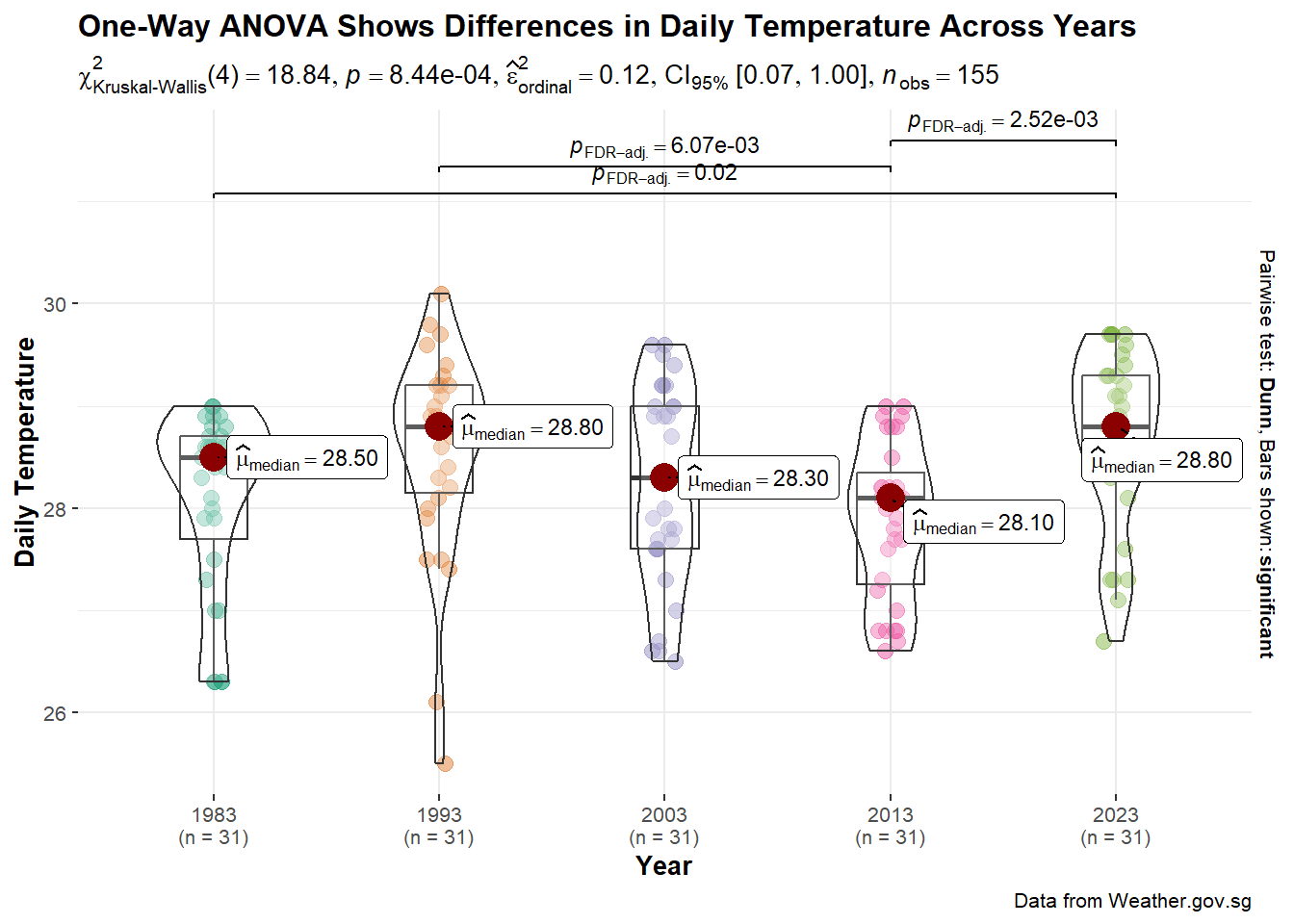
As noted above, the hypothesis testing is done using Kruskal-Wallis test with 95% confidence level. The hypothesis is:
H0 : There is no difference between median daily temperatures between years.
H1 : There is difference between median daily temperatures between years.
extract_stats(test1)$subtitle_data
# A tibble: 1 × 15
parameter1 parameter2 statistic df.error p.value method
<chr> <chr> <dbl> <int> <dbl> <chr>
1 DailyTemp Year 18.8 4 0.000844 Kruskal-Wallis rank sum test
effectsize estimate conf.level conf.low conf.high conf.method
<chr> <dbl> <dbl> <dbl> <dbl> <chr>
1 Epsilon2 (rank) 0.122 0.95 0.0730 1 percentile bootstrap
conf.iterations n.obs expression
<int> <int> <list>
1 100 155 <language>
$caption_data
NULL
$pairwise_comparisons_data
# A tibble: 10 × 9
group1 group2 statistic p.value alternative distribution p.adjust.method
<chr> <chr> <dbl> <dbl> <chr> <chr> <chr>
1 1983 1993 2.29 0.0553 two.sided z FDR
2 1983 2003 0.803 0.469 two.sided z FDR
3 1983 2013 0.947 0.429 two.sided z FDR
4 1983 2023 2.71 0.0222 two.sided z FDR
5 1993 2003 1.49 0.196 two.sided z FDR
6 1993 2013 3.24 0.00607 two.sided z FDR
7 1993 2023 0.425 0.671 two.sided z FDR
8 2003 2013 1.75 0.133 two.sided z FDR
9 2003 2023 1.91 0.112 two.sided z FDR
10 2013 2023 3.66 0.00252 two.sided z FDR
test expression
<chr> <list>
1 Dunn <language>
2 Dunn <language>
3 Dunn <language>
4 Dunn <language>
5 Dunn <language>
6 Dunn <language>
7 Dunn <language>
8 Dunn <language>
9 Dunn <language>
10 Dunn <language>
$descriptive_data
NULL
$one_sample_data
NULL
$tidy_data
NULL
$glance_data
NULLSince the p-value (0.0008444241) is less than the critical value of 0.05, there is statistical evidence to reject the null hypothesis. We can conclude that there is difference between median daily temperature.
In the above plot, we observed that there are certain pairs of years with p-value less than 0.05. These pairs are: 1983 and 2023, 1993 and 2013, 2013 and 2023. This suggests that the differences between the medians of these pairs are statistically significant.
Looking at the significant differences between 1983 and 2023 and 2013 and 2023, based on the medians, it seems that there was indeed a temperature rise from 1983 to 2023 and from 2013 and 2023. However, the differences between the medians were small, which were different from the figures quoted. We would need more years of data to ascertain the projectation that daily mean temperature would increase by 1.4 to 4.6 Degree Celsius.
As we are using point estimates (i.e. median), there are uncertainties surrounding the point estimates since each estimate is derived from a bunch of figures. In our case, each median daily temperature for the year is derived from the 31 daily temperatures in August for the year. As such, it would be more accurate and informative to show the target quantile confidence levels (e.g. 95% or 99%) that the true (unknown) estimate would lie within the interval, given the evidence provided by the observed data.
For the following plot, we will use median point estimates instead of mean due to outliers and skewness of data. In addition, using median also allows to user to relate to the above one-way ANOVA analysis
With median as the point estimate, quantile intervals are used instead of confidence interval. We use 95% and 99% intervals because they are commonly associated with 5% and 1% error rate, which are commonly used in hypothesis testing.
#Base ggplot
p2 <- ggplot(
  data = changitemp,
  aes(x = Year,
      y = DailyTemp)) +

  #Using stat_pointinterval to plot the points and intervals
  stat_pointinterval(
    aes(interval_color = stat(level)),
    .width = c(0.95, 0.99),
    .point = median,
    .interval = qi,
    point_color = "black",
    show.legend = TRUE) +
   stat_summary(fun = median, geom = "text", aes(label = round(after_stat(y), 1)), position = position_nudge(x = 0.15), vjust = -0.5,size=3)+

  #Add title, subtitle, x-axis labels
  labs(title = "Uncertainty in Median Daily Temperature in the Month of August",
subtitle = "Years: 1983, 1993, 2003, 2013, 2023 \nWeather Station: Changi \nQuantile Intervals: 95% and 99% of Daily Temperature") +
  xlab("Year") +
  ylab("Daily Temperature (Degree Celsius)")+

  #Add a theme
  theme_ipsum_rc(plot_title_size = 13, plot_title_margin=4, subtitle_size=11, subtitle_margin=4,
                 axis_title_size = 8, axis_text_size=8, axis_title_face= "bold", plot_margin = margin(4, 4, 4, 4))

p2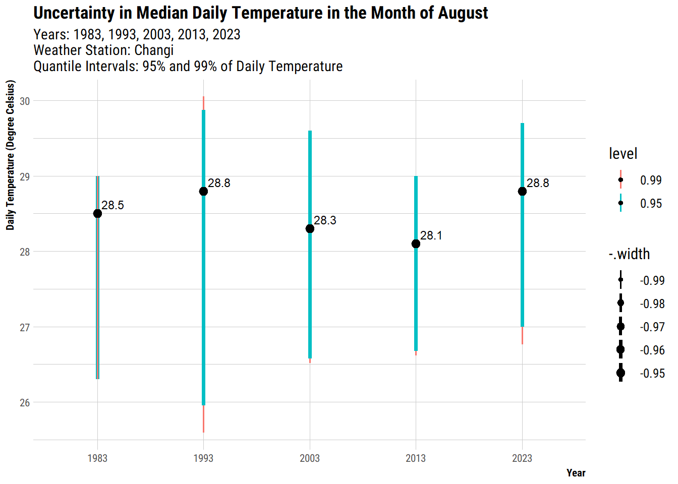
The length of the error bars indicates the amount of uncertainty. For those years with more outliers or more varied temperatures, they have higher uncertainities, hence longer length of error bar. For example Year 1993 had a wide range of daily temperatures as compared to other years. In contrast, 2013 had a relatively smaller range of temperatures and less outliers, hence a shorter length of error bar because it had lower uncertainties.
To help users to explore the data, based on the experience from the above sections, it seems more useful to look at the spread of the temperature and the central tendency (i.e. median) since we are for increasing trend over the years. As such, we will conclude this exercise by plotting a raincloud plot to visualise the distribution and uncertainty of the temperature data.
To visualise a raincloud plot, we:
plot the stat_slab from ggdist package to show the probability distribution of the data
use ggiraph to create an interactive box plot and interactive dotplot via geom_barplot_interactive() and geom_dotplot_interactive()
customise tooltip for the dotplot and barplot using the tooltip = so that when users’ mouse hover on a particular dot, they could see the day, year and temperature of the day.
allow the dots from the same year to be highlighted together using data_id = Year so that users can see how the temperature are distributed as compared to the other years.
add title, subtitle, x-axis label to provide information on the chart
add a theme from hrbrthemes to further format the chart so that it is publication ready.
d1 <- highlight_key(changitemp)

# base plot
c1 <- ggplot(data=d1,
       aes(x = Year,
           y = DailyTemp)) +
  #slab
  stat_slab(adjust = 0.1,
            justification = -0.3,
            height = 0.6,
            position = position_nudge(x=-0.2)) +
  #boxplot
  geom_boxplot_interactive(
    aes(x = Year,
        y = DailyTemp,
        fill = Year,
        tooltip = after_stat({
        paste0(
          "Min: ", prettyNum(.data$ymin),
          "\nMax: ", prettyNum(.data$ymax),
          "\nMedian: ", prettyNum(.data$middle)
        )
      })
      ),
    width = 0.15,
    position= position_nudge(x=0),
    outlier.shape = NA,
   show.legend = FALSE) +
   stat_summary(fun = mean, geom = "point", shape = 16, size = 1.5, color = "red",
               position = position_nudge(x = 0.0)) +

  #dotplot
  geom_dotplot_interactive(
    aes(data_id = Day,
        tooltip = paste0("Day: ", Day, " Year: ", Year, " Temp: ", DailyTemp)),
    binaxis = "y",
    position= position_nudge(x=-0.1),
    stackdir = "down",
    stackgroups = TRUE,
    justification = 1.2,
    binwidth = 0.05,
    method = "histodot") +

  #Add title, subtitle, x-axis labels
  labs(title = "Distribution of Daily Temperature in the Month of August",
subtitle = "Years: 1983, 1993, 2003, 2013, 2023 \n Weather Station: Changi") +
  xlab("Year") +
  ylab("Daily Temperature (Degree Celsius)")+
  coord_flip()+

  #Add a theme
  theme_ipsum_rc(plot_title_size = 13, plot_title_margin=4, subtitle_size=11, subtitle_margin=4,
                 axis_title_size = 8, axis_text_size=8, axis_title_face= "bold", plot_margin = margin(4, 4, 4, 4))

girafe(
  ggobj = c1,
  width_svg = 6,
  height_svg = 6*0.618,
  options = list(
         opts_hover(css = "fill:#FF33A2;"),
         opts_hover_inv(css = "opacity:0.2;")
         )
) Kam, T. S. (2023). R for Visual Analytics [Web-book]. https://r4va.netlify.app/.
Kay M (2024). “ggdist: Visualizations of Distributions and Uncertainty in the Grammar of Graphics.” IEEE Transactions on Visualization and Computer Graphics, 1–11. doi:10.1109/TVCG.2023.3327195.
Meterological Service Singapore. (n.d.). Home | [Dataset]. Meterological Service Singapore. https://www.weather.gov.sg/home/
Wickham, H., Navarro, D., & Pedersen, T. L. (2024). ggplot2: Elegant Graphics for Data Analysis (3rd ed.). https://ggplot2-book.org/.