Show the code
pacman::p_load(tidyverse, DT, GGally, parallelPlot)In this exercise, we will learn how to:
plotting static parallel coordinates plots by using ggparcoord() of GGally package, and
plotting interactive parallel coordinates plots by using parallelPlot package.
Parallel coordinates plot is a data visualisation specially designed for visualising and analysing multivariate, numerical data. It is ideal for comparing multiple variables together and seeing the relationships between them. For example, the variables contribute to Happiness Index. Parallel coordinates was invented by Alfred Inselberg in the 1970s as a way to visualize high-dimensional data. This data visualisation technique is more often found in academic and scientific communities than in business and consumer data visualizations. As pointed out by Stephen Few(2006), “This certainly isn’t a chart that you would present to the board of directors or place on your Web site for the general public. In fact, the strength of parallel coordinates isn’t in their ability to communicate some truth in the data to others, but rather in their ability to bring meaningful multivariate patterns and comparisons to light when used interactively for analysis.” For example, parallel coordinates plot can be used to characterise clusters detected during customer segmentation.
Before we start, let us ensure that the required R packages have been installed and import the relevant data for this hands-on exercise.
For this exercise, the GGally, parcoords, parallelPlot and tidyverse packages will be used.
The code chunk below uses p_load() of pacman package to check if the abovementioned packages are installed in the computer. If they are, they will be launched in R. Otherwise, pacman will install the relevant packages before launching them.
pacman::p_load(tidyverse, DT, GGally, parallelPlot)For this exercise, we will be using the data from World Happiness 2018 report. The original data set is in Microsoft Excel format. It has been extracted and saved in csv file called WHData-2018.csv.
In the code chunk below, read_csv() of readr is used to import WHData-2018.csv into R and parsed it into tibble R data frame format.
happy <- read_csv("data/WHData-2018.csv")In this section, you will learn how to plot static parallel coordinates plot by using ggparcoord() of GGally package.
ggparcoord(data = happy,
columns = c(7:12)) 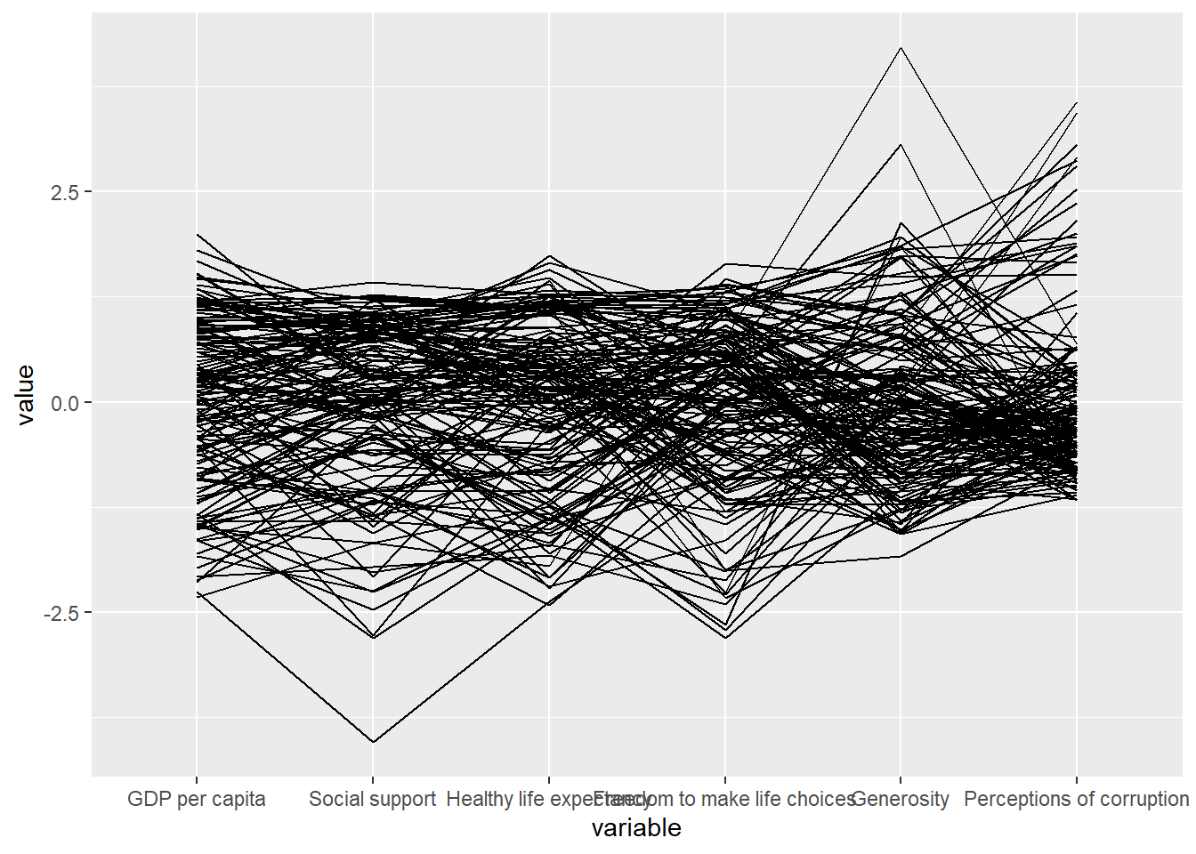
Notice that only two argument namely data and columns is used. Data argument is used to map the data object (i.e. wh) and columns is used to select the columns for preparing the parallel coordinates plot.
The earlier chart does not provide us with useful understanding of the World Happiness measures. As such, we will make over the plot using a collection of arguments provided by ggparcoord().
ggparcoord(data = happy,
           columns = c(7:12),
           groupColumn = 2,
           scale = "uniminmax",
           alphaLines = 0.2,
           boxplot = TRUE,
           title = "Parallel Coordinates Plot of World Happines Variables")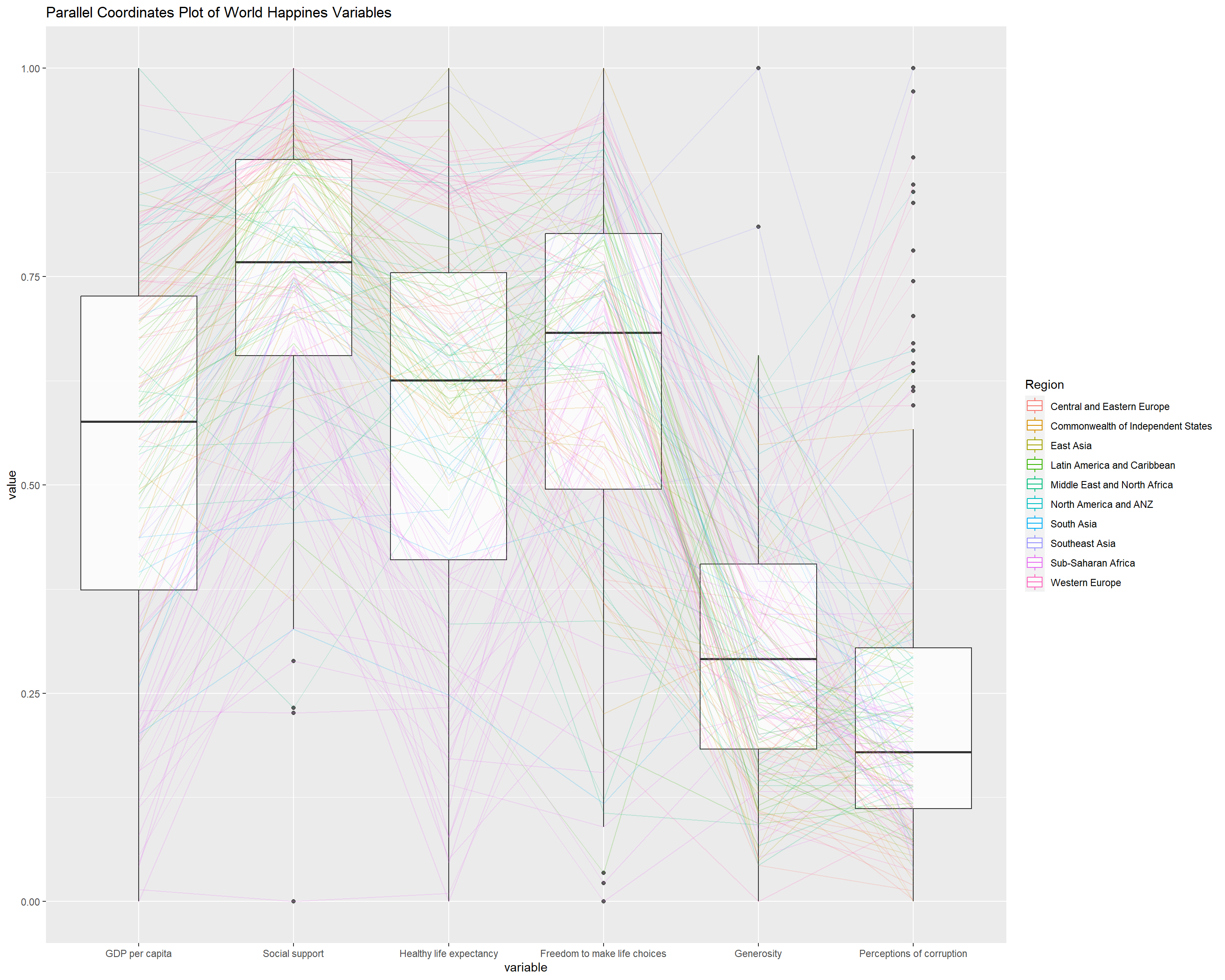
Since ggparcoord() is developed by extending ggplot2 package, we can combination use some of the ggplot2 function when plotting a parallel coordinates plot.
In the code chunk below, facet_wrap() of ggplot2 is used to plot 10 small multiple parallel coordinates plots. Each plot represent one geographical region such as East Asia.
ggparcoord(data = happy,
           columns = c(7:12),
           groupColumn = 2,
           scale = "uniminmax",
           alphaLines = 0.2,
           boxplot = TRUE,
           title = "Multiple Parallel Coordinates Plots of World Happines Variables by Region") +
  facet_wrap(~ Region)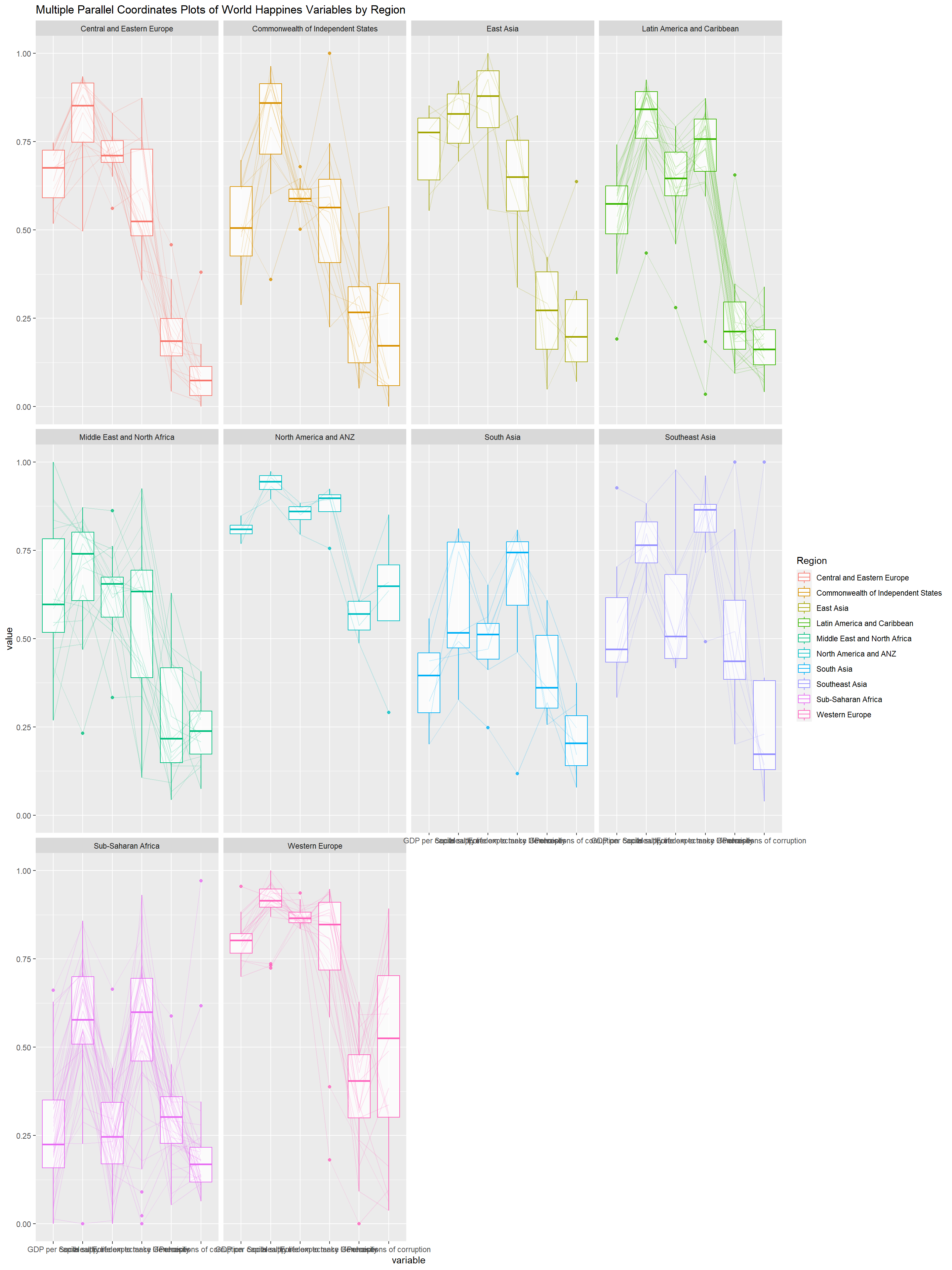
Some of the variable names overlap on x-axis!
To make the x-axis text label easy to read, let us rotate the labels by 30 degrees. We can rotate axis text labels using axis.text.x as argument to the theme() function. And we specify element_text(angle = 30) to rotate the x-axis text by an angle 30 degree.
ggparcoord(data = happy,
           columns = c(7:12),
           groupColumn = 2,
           scale = "uniminmax",
           alphaLines = 0.2,
           boxplot = TRUE,
           title = "Multiple Parallel Coordinates Plots of World Happines Variables by Region") +
  facet_wrap(~ Region) +
  theme(axis.text.x = element_text(angle = 30))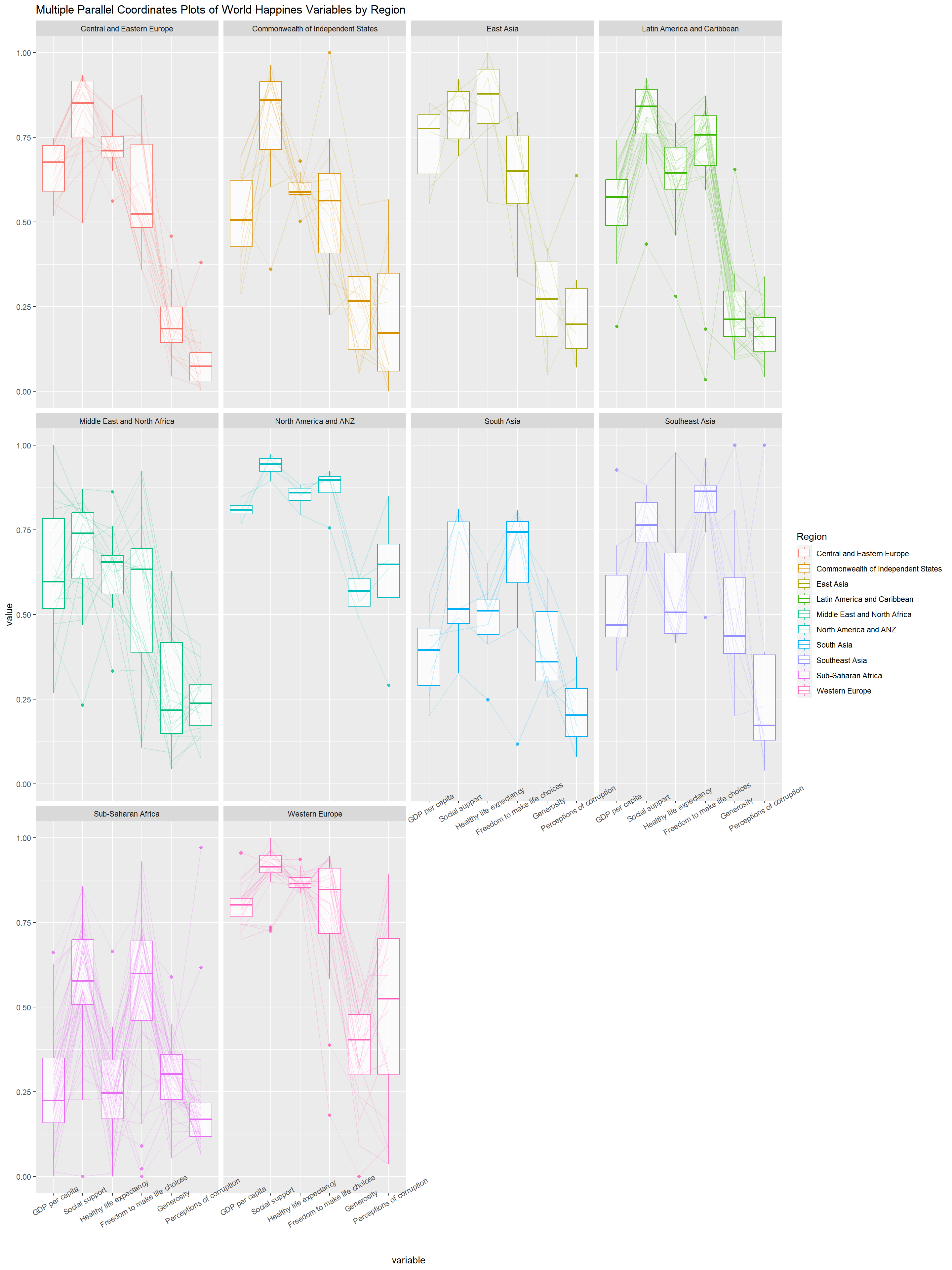
Rotating x-axis text labels to 30 degrees makes the label overlap with the plot and we can avoid this by adjusting the text location using hjust argument to theme’s text element with element_text(). We use axis.text.x as we want to change the look of x-axis text.
ggparcoord(data = happy,
           columns = c(7:12),
           groupColumn = 2,
           scale = "uniminmax",
           alphaLines = 0.2,
           boxplot = TRUE,
           title = "Multiple Parallel Coordinates Plots of World Happines Variables by Region") +
  facet_wrap(~ Region) +
  theme(axis.text.x = element_text(angle = 30, hjust=1))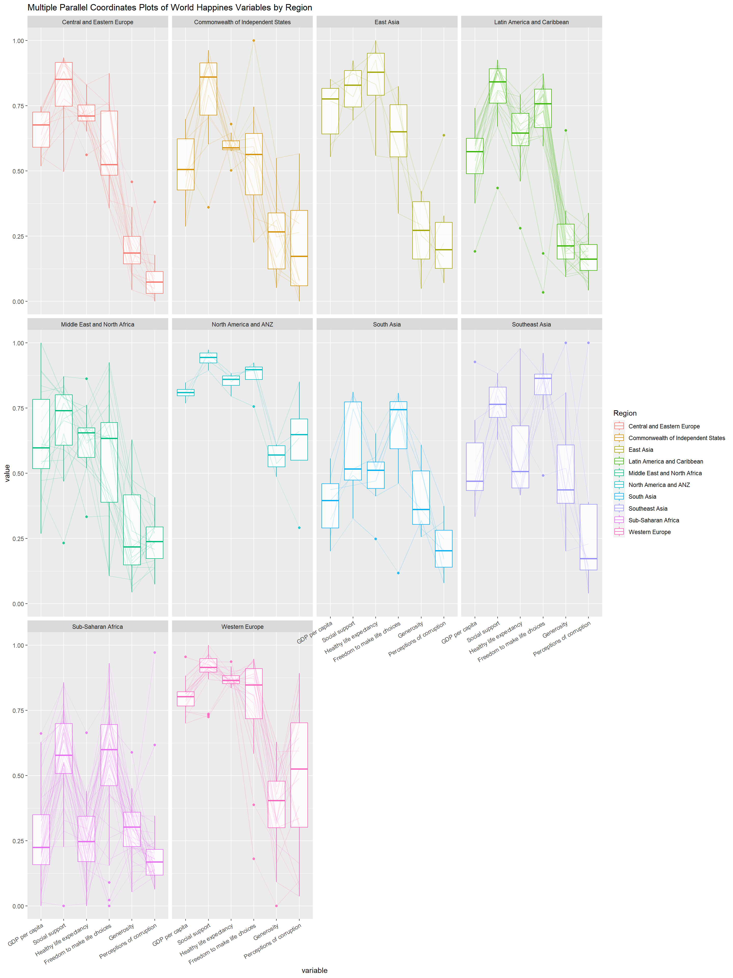
parallelPlot is an R package specially designed to plot a parallel coordinates plot by using ‘htmlwidgets’ package and d3.js. In this section, you will learn how to use functions provided in parallelPlot package to build interactive parallel coordinates plot.
First we select the columns that we want using the following code chunk.
happy <- happy %>%
  select("Happiness score", c(7:12))
Then we plot the interactive parallel coordinates plot using parallelPlot() function.
parallelPlot(happy,
             width = 320,
height = 500)We will use the following code chunk to rotate the axis label to avoid them from overlapping.
parallelPlot(happy,
rotateTitle = TRUE)We can change the default blue colour scheme by using continousCS argument as shown in the code chunk below.
parallelPlot(happy,
             continuousCS = "Reds",
rotateTitle = TRUE) In the code chunk below, histoVisibility argument is used to plot histogram along the axis of each variables.
histoVisibility <- rep(TRUE, ncol(happy))
parallelPlot(happy,
             rotateTitle = TRUE,
             histoVisibility = histoVisibility)