Show the code
pacman::p_load(tidyverse, DT, seriation, dendextend, heatmaply)In this exercise, we will learn how to use R to plot static and interactive heatmap for visualising and analysing multivariate data.
Heatmaps visualise data through variations in colouring. When applied to a tabular format, heatmaps are useful for cross-examining multivariate data, through placing variables in the columns and observation (or records) in rowa and colouring the cells within the table. Heatmaps are good for showing variance across multiple variables, revealing any patterns, displaying whether any variables are similar to each other, and for detecting if any correlations exist in-between them.
Before we start, let us ensure that the required R packages have been installed and import the relevant data for this hands-on exercise.
The code chunk below uses p_load() of pacman package to check if the abovementioned packages are installed in the computer. If they are, they will be launched in R. Otherwise, pacman will install the relevant packages before launching them.
pacman::p_load(tidyverse, DT, seriation, dendextend, heatmaply)For this exercise, we will be using the data from World Happiness 2018 report. The original data set is in Microsoft Excel format. It has been extracted and saved in csv file called WHData-2018.csv.
In the code chunk below, read_csv() of readr is used to import WHData-2018.csv into R and parsed it into tibble R data frame format.
happy <- read_csv("data/WHData-2018.csv")datatable(happy)glimpse(happy)Rows: 156
Columns: 12
$ Country <chr> "Albania", "Bosnia and Herzegovina", "B…
$ Region <chr> "Central and Eastern Europe", "Central …
$ `Happiness score` <dbl> 4.586, 5.129, 4.933, 5.321, 6.711, 5.73…
$ `Whisker-high` <dbl> 4.695, 5.224, 5.022, 5.398, 6.783, 5.81…
$ `Whisker-low` <dbl> 4.477, 5.035, 4.844, 5.244, 6.639, 5.66…
$ Dystopia <dbl> 1.462, 1.883, 1.219, 1.769, 2.494, 1.45…
$ `GDP per capita` <dbl> 0.916, 0.915, 1.054, 1.115, 1.233, 1.20…
$ `Social support` <dbl> 0.817, 1.078, 1.515, 1.161, 1.489, 1.53…
$ `Healthy life expectancy` <dbl> 0.790, 0.758, 0.712, 0.737, 0.854, 0.73…
$ `Freedom to make life choices` <dbl> 0.419, 0.280, 0.359, 0.380, 0.543, 0.55…
$ Generosity <dbl> 0.149, 0.216, 0.064, 0.120, 0.064, 0.08…
$ `Perceptions of corruption` <dbl> 0.032, 0.000, 0.009, 0.039, 0.034, 0.17…For the purpose of this exercise, we need to change the rows by country name instead of row number.
row.names(happy) <- happy$Country
datatable(happy)The data was loaded into a data frame, but it has to be a data matrix to make your heatmap.
The code chunk below will be used to transform happy data frame into a data matrix.
happy_matrix <- data.matrix(happy)There are many R packages and functions can be used to drawing static heatmaps, they are:
In this section, we will learn how to plot static heatmaps by using heatmap() of R Stats package.By default, heatmap() plots a cluster heatmap. The arguments Rowv=NA and Colv=NA are used to switch off the option of plotting the row and column dendrograms.
happy_heatmap <- heatmap(happy_matrix)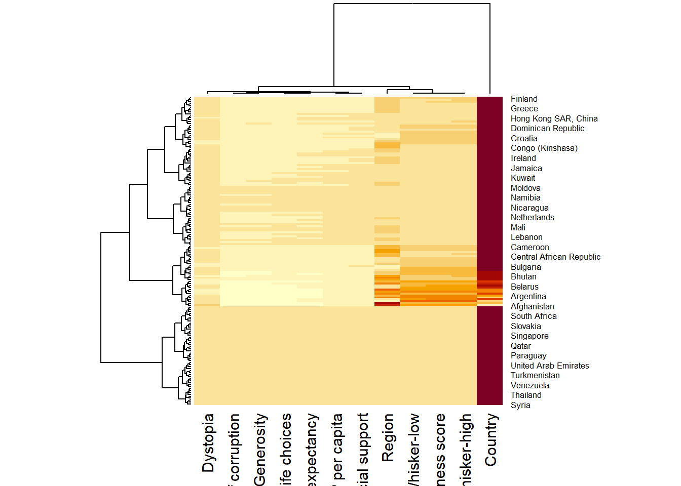
happy_heatmap <- heatmap(happy_matrix,Rowv=NA, Colv=NA )
The order of both rows and columns is different compare to the native happy_matrix. This is because heatmap do a reordering using clusterisation: it calculates the distance between each pair of rows and columns and try to order them by similarity. In addition, the corresponding dendrograms are provided beside the heatmap.
By default, red cells denotes small values. As the Happiness Score variable have relatively higher values, this makes other variables with small values all look the same.Thus, we need to normalize this matrix. This is done using the scale argument. It can be applied to rows or to columns following your needs.
happy_heatmap_c <- heatmap(happy_matrix,
                      scale="column",
                      cexRow = 0.6,
                      cexCol = 0.8,
                      margins = c(10, 4))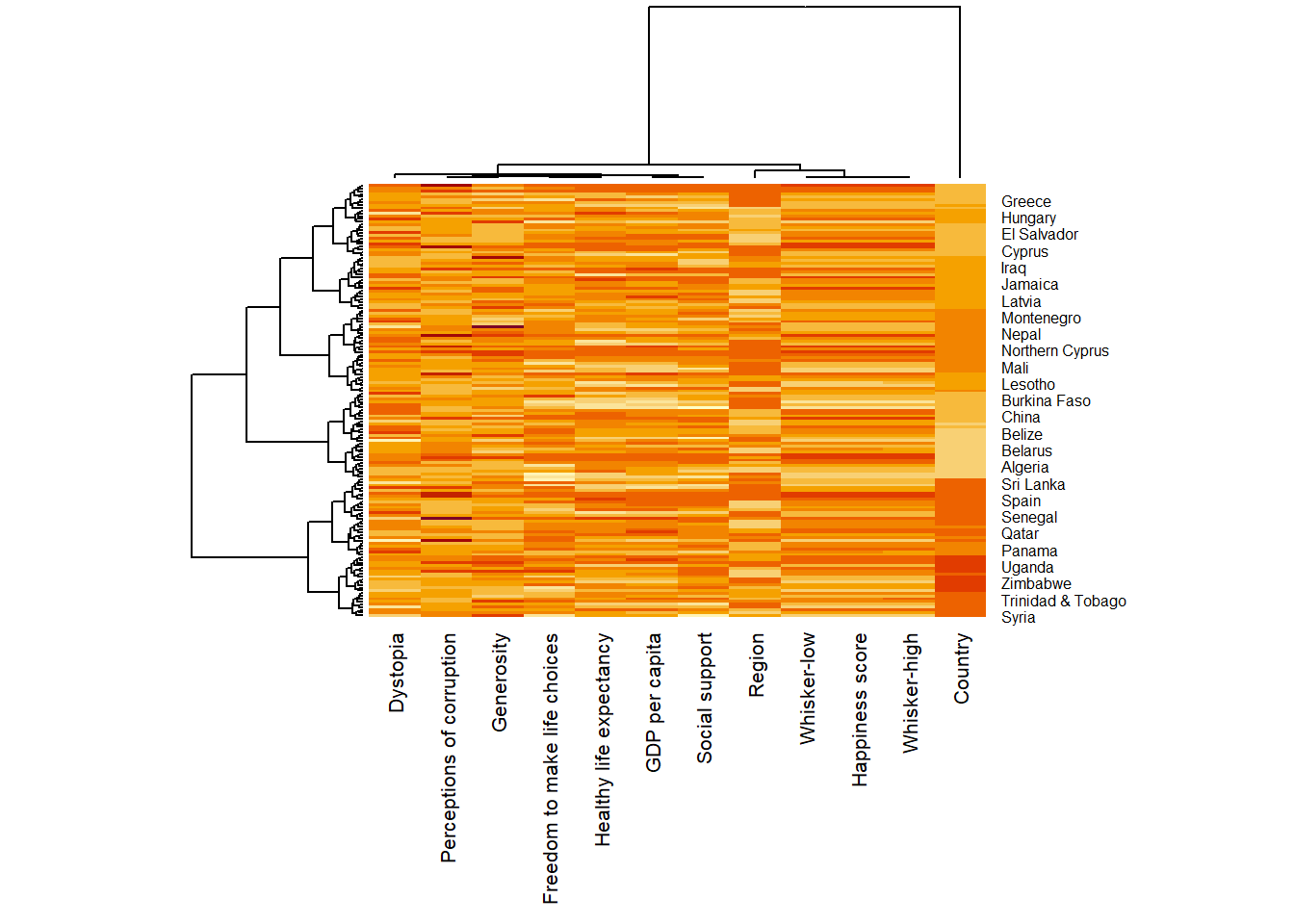
happy_heatmap_r <- heatmap(happy_matrix,
                      scale="row",
                      cexRow = 0.6,
                      cexCol = 0.8,
                      margins = c(10, 4))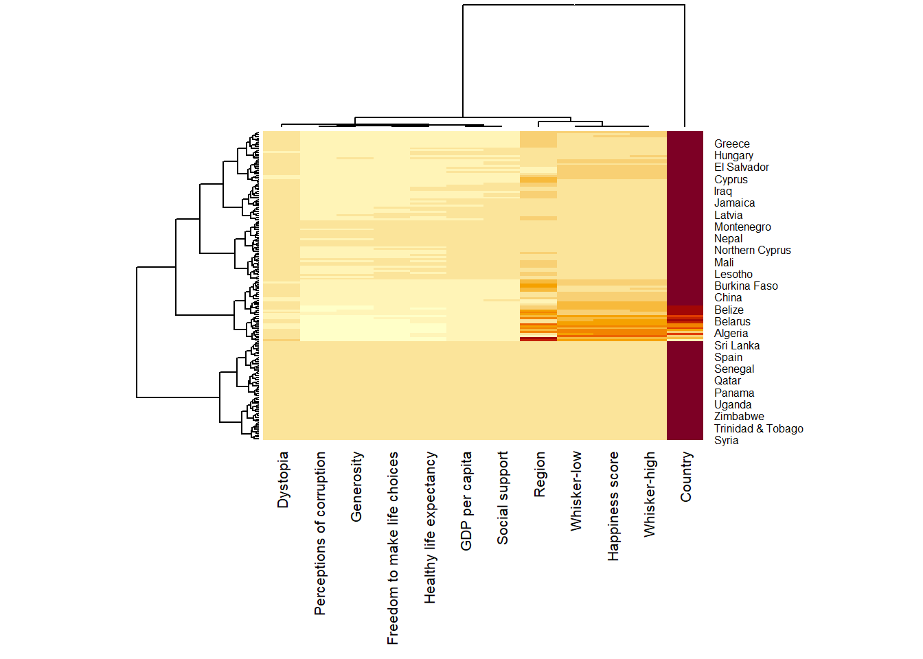
Notice that the values are scaled now. Also note that margins argument is used to ensure that the entire x-axis labels are displayed completely and, cexRow and cexCol arguments are used to define the font size used for y-axis and x-axis labels respectively.
heatmaply is an R package for building interactive cluster heatmap that can be shared online as a stand-alone HTML file. It is designed and maintained by Tal Galili.
Using the function heatmaply(), we can easily create an interactive heat map by putting the datamatrix into it. For this example, we will put happy_matrix into it and also tell the function to not use the columns “Country”, “Region”, ‘whisker-high’ and ‘whisker-low’(i.e., columns 1, 2, 4 and 5)
heatmaply(happy_matrix[, -c(1,2,4,5)])Different from heatmap(), for heatmaply() the default horizontal dendrogram is placed on the left hand side of the heatmap. The text label of each raw, on the other hand, is placed on the right hand side of the heat map. When the x-axis marker labels are too long, they will be rotated by 135 degree from the north.
When analysing multivariate data set, it is very common that the variables in the data sets includes values that reflect different types of measurement. In general, these variables’ values have their own range. In order to ensure that all the variables have comparable values, data transformation are commonly used before clustering.
Three main data transformation methods are supported by heatmaply(), namely: scale, normalise and percentilse.
The following code chunk scales the variable values columnwise.
heatmaply(happy_matrix[, -c(1,2,4,5)],
          scale = "column",
          fontsize_row = 4,
fontsize_col = 8)heatmaply(normalize(happy_matrix[, -c(1, 2, 4, 5)]),
fontsize_row = 4,
fontsize_col = 8)heatmaply(percentize(happy_matrix[, -c(1, 2, 4, 5)]),
fontsize_row = 4,
fontsize_col = 8)heatmaply supports a variety of hierarchical clustering algorithm. The main arguments provided are:
distfun: function used to compute the distance (dissimilarity) between both rows and columns. Defaults to dist. The options “pearson”, “spearman” and “kendall” can be used to use correlation-based clustering, which uses as.dist(1 - cor(t(x))) as the distance metric (using the specified correlation method).
hclustfun: function used to compute the hierarchical clustering when Rowv or Colv are not dendrograms. Defaults to hclust.
dist_method default is NULL, which results in “euclidean” to be used. It can accept alternative character strings indicating the method to be passed to distfun. By default distfun is “dist”” hence this can be one of “euclidean”, “maximum”, “manhattan”, “canberra”, “binary” or “minkowski”.
hclust_method default is NULL, which results in “complete” method to be used. It can accept alternative character strings indicating the method to be passed to hclustfun. By default hclustfun is hclust hence this can be one of “ward.D”, “ward.D2”, “single”, “complete”, “average” (= UPGMA), “mcquitty” (= WPGMA), “median” (= WPGMC) or “centroid” (= UPGMC).
In general, a clustering model can be calibrated either manually or statistically.
The following heatmap is plotted using hierarchical clustering algorithm with Euclidean distance and ward.D method.
heatmaply(normalize(happy_matrix[, -c(1, 2, 4, 5)]),
          dist_method = "euclidean",
          hclust_method = "ward.D",
          fontsize_row = 4,
fontsize_col = 8)In order to determine the best clustering method and number of clusters the dend_expend() and find_k() functions of dendextend package will be used.
First, the dend_expend() will be used to determine the recommended clustering method to be used.
#normalise the data and compute Eucliean distance
happy_d <- dist(normalize(happy_matrix[, -c(1, 2, 4, 5)]), method = "euclidean")

dend_expend(happy_d)[[3]]
dist_methods hclust_methods optim
1 unknown ward.D 0.6137851
2 unknown ward.D2 0.6289186
3 unknown single 0.4774362
4 unknown complete 0.6434009
5 unknown average 0.6701688
6 unknown mcquitty 0.5020102
7 unknown median 0.5901833
8 unknown centroid 0.6338734The output table shows that “average” method should be used because it gave the highest optimum value of 0.6701688.
Next, find_k() is used to determine the optimal number of cluster.
happy_clust <- hclust(happy_d, method = "average")
num_k <- find_k(happy_clust)
plot(num_k)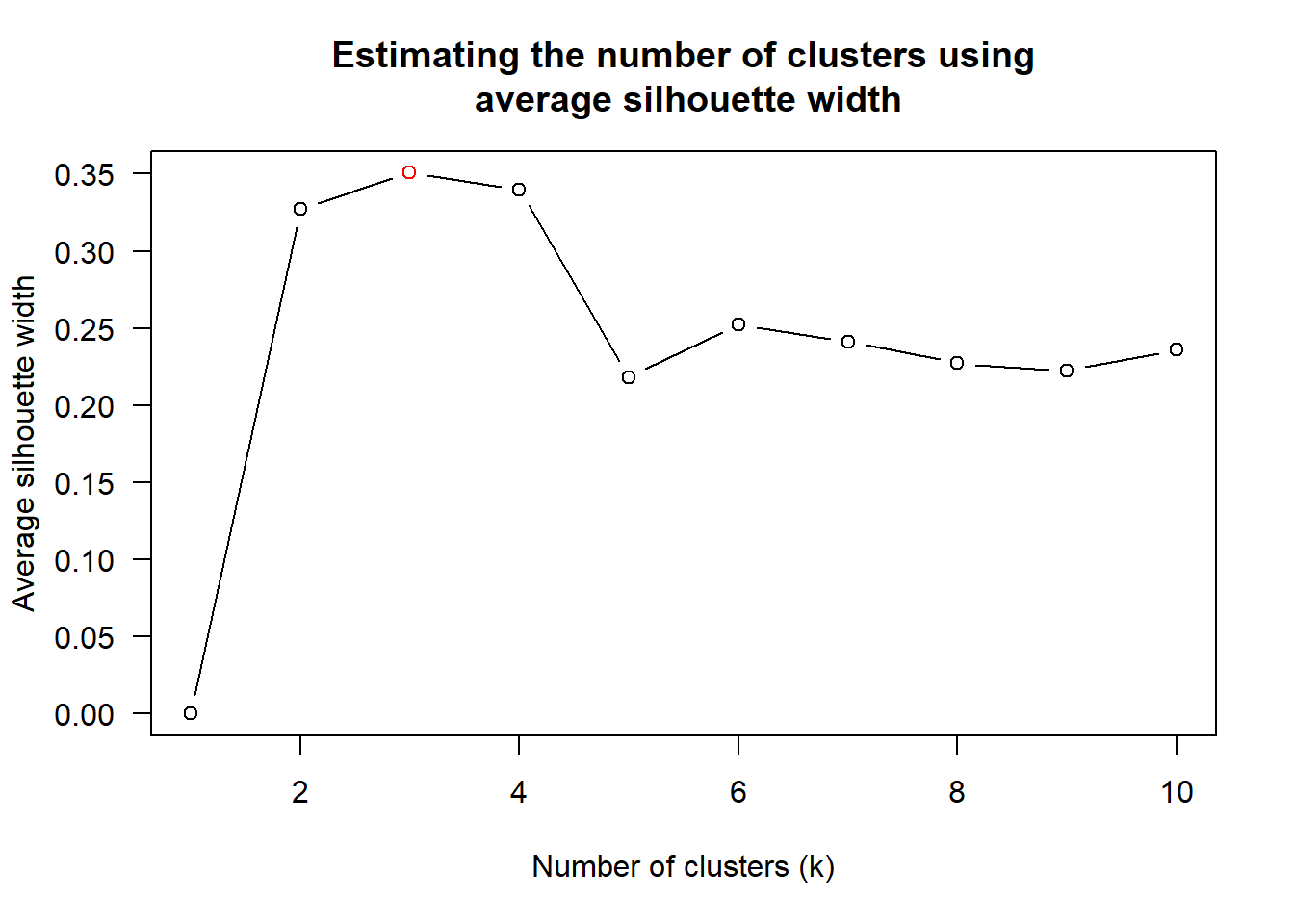
Figure above shows that k=3 would be good since it has the highest average silhouette width.
With reference to the statistical analysis results, we can prepare the code chunk as shown below.
heatmaply(normalize(happy_matrix[, -c(1, 2, 4, 5)]),
          dist_method = "euclidean",
          hclust_method = "average",
          k_row = 3,
          fontsize_row = 4,
fontsize_col = 8)One of the problems with hierarchical clustering is that it doesn’t actually place the rows in a definite order, it merely constrains the space of possible orderings. Take three items A, B and C. If you ignore reflections, there are three possible orderings: ABC, ACB, BAC. If clustering them gives you ((A+B)+C) as a tree, you know that C can’t end up between A and B, but it doesn’t tell you which way to flip the A+B cluster. It doesn’t tell you if the ABC ordering will lead to a clearer-looking heatmap than the BAC ordering.
heatmaply uses the seriation package to find an optimal ordering of rows and columns. Optimal means to optimize the Hamiltonian path length that is restricted by the dendrogram structure. This, in other words, means to rotate the branches so that the sum of distances between each adjacent leaf (label) will be minimized. This is related to a restricted version of the travelling salesman problem.
The first seriation algorithm that we are going to learn is Optimal Leaf Ordering (OLO). This algorithm starts with the output of an agglomerative clustering algorithm and produces a unique ordering, one that flips the various branches of the dendrogram around so as to minimize the sum of dissimilarities between adjacent leaves. Here is the result of applying Optimal Leaf Ordering (i.e. the default option) to the same clustering result as the heatmap above.
heatmaply(normalize(happy_matrix[, -c(1, 2, 4, 5)]),
          seriate = "OLO",
          fontsize_row = 4,
          fontsize_col = 8)
Optimal leaf ordering optimizes the above criterion (in O(n^4)).
Another option is “GW” (Gruvaeus and Wainer) which aims for the same goal but uses a potentially faster heuristic.
heatmaply(normalize(happy_matrix[, -c(1,2,4,5)]),
          seriate = "GW",
          fontsize_row = 4,
          fontsize_col = 8)
The third option “mean” gives the output we would get by default from heatmap functions in other packages such as gplots::heatmap.2.
heatmaply(normalize(happy_matrix[, -c(1, 2, 4, 5)]),
          seriate = "mean",
          fontsize_row = 4,
          fontsize_col = 8)
The option “none” gives us the dendrograms without any rotation that is based on the data matrix.
heatmaply(normalize(happy_matrix[, -c(1, 2, 4, 5)]),
          seriate = "none",
          fontsize_row = 4,
fontsize_col = 8)The default colour palette uses by heatmaply is viridis. heatmaply users, however, can use other colour palettes in order to improve the aestheticness and visual friendliness of the heatmap.
In the following code chunk, we use the RdPu colour palette of rcolorbrewer.
heatmaply(normalize(happy_matrix[, -c(1, 2, 4, 5)]),
          seriate = "none",
          colors = RdPu,
          fontsize_row = 4,
fontsize_col = 8)heatmaply also provides many plotting features to ensure cartographic quality heatmap can be produced.
In the code chunk below the following arguments are used:
k_row is used to produce 5 groups.
margins is used to change the top margin to 60 and row margin to 200.
fontsizw_row and fontsize_col are used to change the font size for row and column labels to 4.
main is used to write the main title of the plot.
xlab and ylab are used to write the x-axis and y-axis labels respectively.
heatmaply(normalize(happy_matrix[, -c(1, 2, 4, 5)]),
          Colv=NA,
          seriate = "none",
          colors = RdPu,
          k_row = 5,
          margins = c(NA,200,60,NA),
          fontsize_row = 5,
          fontsize_col = 5,
          main="World Happiness Score and Variables by Country, 2018 \nDataTransformation using Normalise Method",
          xlab = "World Happiness Indicators",
          ylab = "World Countries"
          )