Show the code
pacman::p_load(tidyverse, plotly, corrplot, ggpubr, DT, ggstatsplot)In this exercise, we will learn how to visualise correlation matrix using R. There are 3 main sections of this exercise. First, we will learn how to create a correlation matrix using pairs() of R Graphics. Then we will learn how to plot corrgram using corrplot package of R. Lastly, we will create an interactive correlation matrix using plotly R.
Correlation coefficient measures the type and strength of the relationship between 2 variables. The values of a correlation coefficient ranges between -1.0 and 1.0. A correlation coefficient of 1 shows a perfect linear relationship between the two variables, while a -1.0 shows a perfect inverse relationship between the two variables. A correlation coefficient of 0.0 shows no linear relationship between the two variables.
When we have multivariate data, the correlation coefficients are pairwise comparisons displayed in a table form, also known as correlation matrix.
There are three main reasons for computing a correlation matrix:
To reveal the relationship between high-dimensional variables pair-wisely
To input into other analyses. For example, correlation matrices can be inputs for exploratory factor analysis, confirmatory factor analysis and linear regression when excluding missing values pairwise.
As a diagnostic when checking other analyses. For example, in linear regression, a high amount of correlation suggests that the linear regression’s estimates would be unreliable.
When the data is large, both in terms of the number of observations and the number of variables, Corrgram tend to be used to visually explore and analyse the structure and the patterns of relations among variables. It is designed based on two main schemes:
Rendering the value of a correlation to depict its sign and magnitude, and
Reordering the variables in a correlation matrix so that “similar” variables are positioned adjacently, facilitating perception.
We will see more of corrgram later in this exercise!
Before we start, let us ensure that the required R packages have been installed and import the relevant data for this hands-on exercise.
For this exercise, other than tidyverse , we will use the following packages:
corrplot: provides a visual exploratory tool on correlation matrix that supports automatic variable reordering to help detect hidden patterns among variables.
ggstatsplot: to create correlation matrix
plotly: makes interactive, publication-quality graphs.
The code chunk below uses p_load() of pacman package to check if the abovementioned packages are installed in the computer. If they are, they will be launched in R. Otherwise, pacman will install the relevant packages before launching them.
pacman::p_load(tidyverse, plotly, corrplot, ggpubr, DT, ggstatsplot)For this exercise, we will be using the Wine Quality Data Set of UCI Machine Learning Repository. The data set consists of 13 variables and 6497 observations. For the purpose of this exercise, we have combined the red wine and white wine data into one data file. It is called wine_quality and is in csv file format.
The following code chunk uses read_csv() function of readr package to import the data into R.
wine <- read_csv("data/wine_quality.csv")datatable(wine)glimpse(wine)Rows: 6,497
Columns: 13
$ `fixed acidity` <dbl> 7.4, 7.8, 7.8, 11.2, 7.4, 7.4, 7.9, 7.3, 7.8, 7…
$ `volatile acidity` <dbl> 0.700, 0.880, 0.760, 0.280, 0.700, 0.660, 0.600…
$ `citric acid` <dbl> 0.00, 0.00, 0.04, 0.56, 0.00, 0.00, 0.06, 0.00,…
$ `residual sugar` <dbl> 1.9, 2.6, 2.3, 1.9, 1.9, 1.8, 1.6, 1.2, 2.0, 6.…
$ chlorides <dbl> 0.076, 0.098, 0.092, 0.075, 0.076, 0.075, 0.069…
$ `free sulfur dioxide` <dbl> 11, 25, 15, 17, 11, 13, 15, 15, 9, 17, 15, 17, …
$ `total sulfur dioxide` <dbl> 34, 67, 54, 60, 34, 40, 59, 21, 18, 102, 65, 10…
$ density <dbl> 0.9978, 0.9968, 0.9970, 0.9980, 0.9978, 0.9978,…
$ pH <dbl> 3.51, 3.20, 3.26, 3.16, 3.51, 3.51, 3.30, 3.39,…
$ sulphates <dbl> 0.56, 0.68, 0.65, 0.58, 0.56, 0.56, 0.46, 0.47,…
$ alcohol <dbl> 9.4, 9.8, 9.8, 9.8, 9.4, 9.4, 9.4, 10.0, 9.5, 1…
$ quality <dbl> 5, 5, 5, 6, 5, 5, 5, 7, 7, 5, 5, 5, 5, 5, 5, 5,…
$ type <chr> "red", "red", "red", "red", "red", "red", "red"…Notice that quality should be considered a factor, rather than a numerical value, since the number represents the “level” of wine quality.
wine$quality <- as.factor(wine$quality)
glimpse(wine)
Rows: 6,497
Columns: 13
$ `fixed acidity` <dbl> 7.4, 7.8, 7.8, 11.2, 7.4, 7.4, 7.9, 7.3, 7.8, 7…
$ `volatile acidity` <dbl> 0.700, 0.880, 0.760, 0.280, 0.700, 0.660, 0.600…
$ `citric acid` <dbl> 0.00, 0.00, 0.04, 0.56, 0.00, 0.00, 0.06, 0.00,…
$ `residual sugar` <dbl> 1.9, 2.6, 2.3, 1.9, 1.9, 1.8, 1.6, 1.2, 2.0, 6.…
$ chlorides <dbl> 0.076, 0.098, 0.092, 0.075, 0.076, 0.075, 0.069…
$ `free sulfur dioxide` <dbl> 11, 25, 15, 17, 11, 13, 15, 15, 9, 17, 15, 17, …
$ `total sulfur dioxide` <dbl> 34, 67, 54, 60, 34, 40, 59, 21, 18, 102, 65, 10…
$ density <dbl> 0.9978, 0.9968, 0.9970, 0.9980, 0.9978, 0.9978,…
$ pH <dbl> 3.51, 3.20, 3.26, 3.16, 3.51, 3.51, 3.30, 3.39,…
$ sulphates <dbl> 0.56, 0.68, 0.65, 0.58, 0.56, 0.56, 0.46, 0.47,…
$ alcohol <dbl> 9.4, 9.8, 9.8, 9.8, 9.4, 9.4, 9.4, 10.0, 9.5, 1…
$ quality <fct> 5, 5, 5, 6, 5, 5, 5, 7, 7, 5, 5, 5, 5, 5, 5, 5,…
$ type <chr> "red", "red", "red", "red", "red", "red", "red"…Since correlation matrices are only for numerical variables, we can also create another dataframe by dropping the non-numerical variables (i.e. quality and type).
wine2 <- wine %>%
  select(-c(quality, type))

glimpse(wine2)
Rows: 6,497
Columns: 11
$ `fixed acidity` <dbl> 7.4, 7.8, 7.8, 11.2, 7.4, 7.4, 7.9, 7.3, 7.8, 7…
$ `volatile acidity` <dbl> 0.700, 0.880, 0.760, 0.280, 0.700, 0.660, 0.600…
$ `citric acid` <dbl> 0.00, 0.00, 0.04, 0.56, 0.00, 0.00, 0.06, 0.00,…
$ `residual sugar` <dbl> 1.9, 2.6, 2.3, 1.9, 1.9, 1.8, 1.6, 1.2, 2.0, 6.…
$ chlorides <dbl> 0.076, 0.098, 0.092, 0.075, 0.076, 0.075, 0.069…
$ `free sulfur dioxide` <dbl> 11, 25, 15, 17, 11, 13, 15, 15, 9, 17, 15, 17, …
$ `total sulfur dioxide` <dbl> 34, 67, 54, 60, 34, 40, 59, 21, 18, 102, 65, 10…
$ density <dbl> 0.9978, 0.9968, 0.9970, 0.9980, 0.9978, 0.9978,…
$ pH <dbl> 3.51, 3.20, 3.26, 3.16, 3.51, 3.51, 3.30, 3.39,…
$ sulphates <dbl> 0.56, 0.68, 0.65, 0.58, 0.56, 0.56, 0.46, 0.47,…
$ alcohol <dbl> 9.4, 9.8, 9.8, 9.8, 9.4, 9.4, 9.4, 10.0, 9.5, 1…Now we are ready to plot the correlation matrix!
One of the methods to create a correlation matrix is to use the pairs function of R Graphics. The required input of pairs() can be a matrix or data frame. To create the scatterplot matrix we just need to put the dataframe into the pairs() function.
pairs(wine2)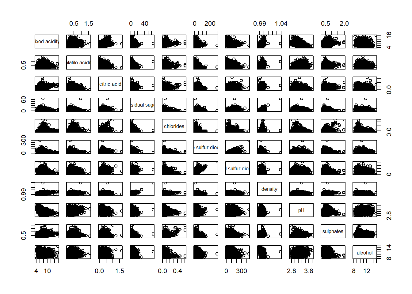
As a correlation matrix is symmetric, we can customise the pairs() function to show the upper or lower half of the matrix.
pairs(wine2, upper.panel = NULL)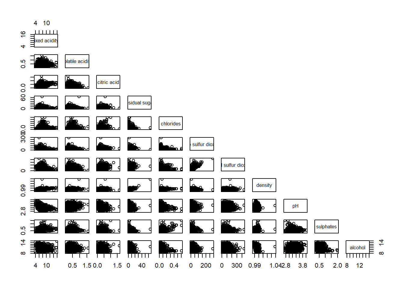
pairs(wine2, lower.panel = NULL)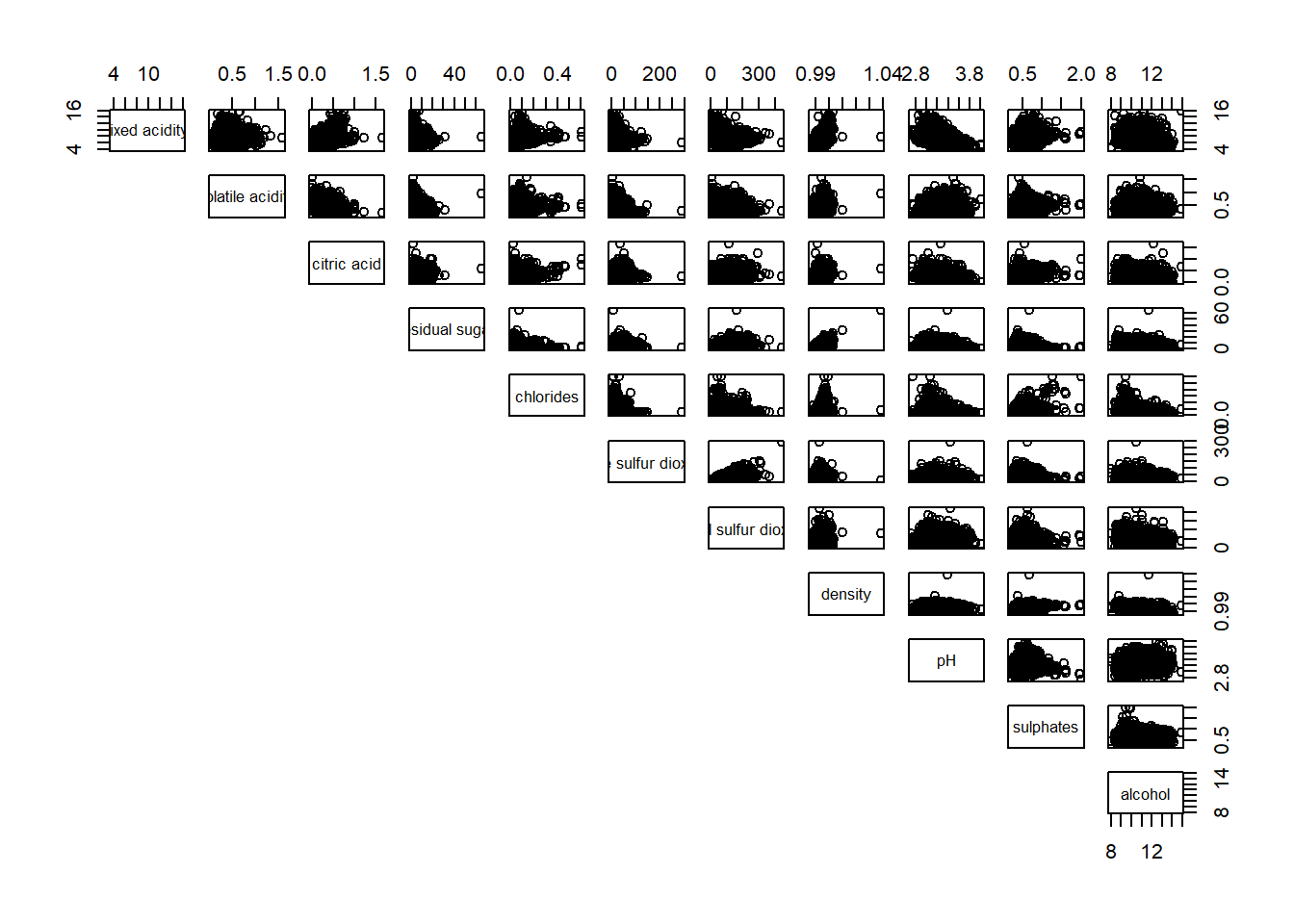
For easy interpretation, we can also show the correlation coefficient of each pair of variables rather than a scatter plot by creating a panel.cor function. Higher correlations are shown in a larger font.
panel.cor <- function (x,y, digits = 2, prefix = "", cex.cor, ...){
  usr <- par("usr")
  on.exit(par(usr))
  par(usr = c(0, 1, 0, 1))
  r <- abs(cor(x, y, use="complete.obs"))
  txt <- format(c(r, 0.123456789), digits=digits)[1]
  txt <- paste(prefix, txt, sep="")
  if(missing(cex.cor)) cex.cor <- 0.8/strwidth(txt)
  text(0.5, 0.5, txt, cex = cex.cor * (1 + r) / 2)
}


pairs(wine2, upper.panel = panel.cor)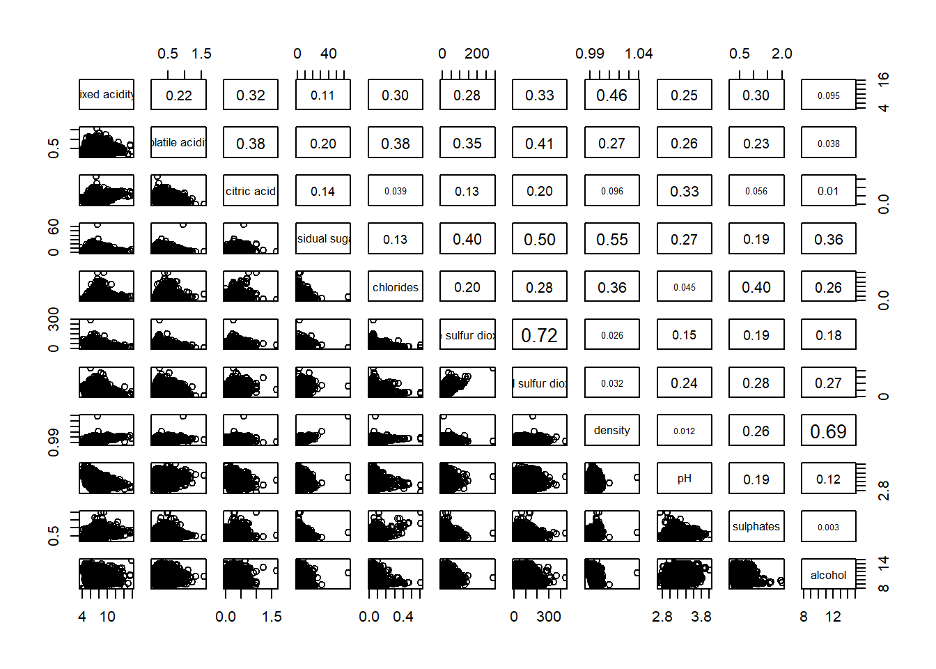
One of the major limitation of the correlation matrix is that the scatter plots appear very cluttered when the number of observations is relatively large (i.e. more than 500 observations). To over come this problem, Corrgram data visualisation technique suggested by D. J. Murdoch and E. D. Chow (1996) and Friendly, M (2002) and will be used.
There are several R packages that provide function to plot corrgram: - corrgram - corrplot - ellipse
On top that, some R package like ggstatsplot package also provides functions for building corrgram.Now, we will learn how to visualise correlation matrix using ggcorrmat() function of ggstatsplot package.
On of the advantage of using ggcorrmat() over many other methods to visualise a correlation matrix is it’s ability to provide a comprehensive and yet professional statistical report as shown below.
ggcorrmat(wine,
          cor.vars = 1:11)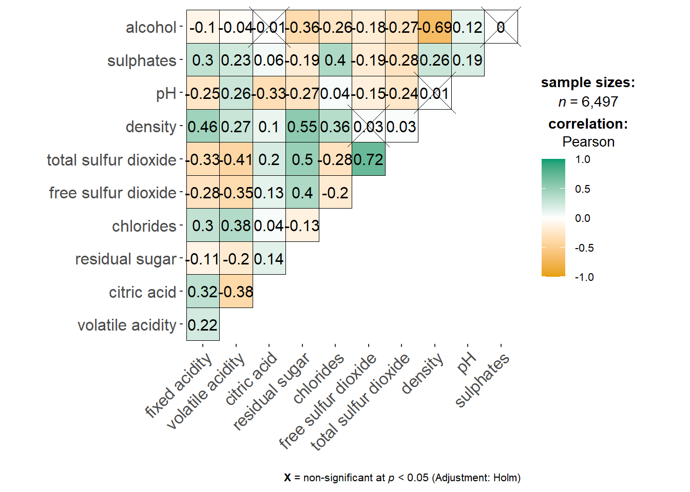
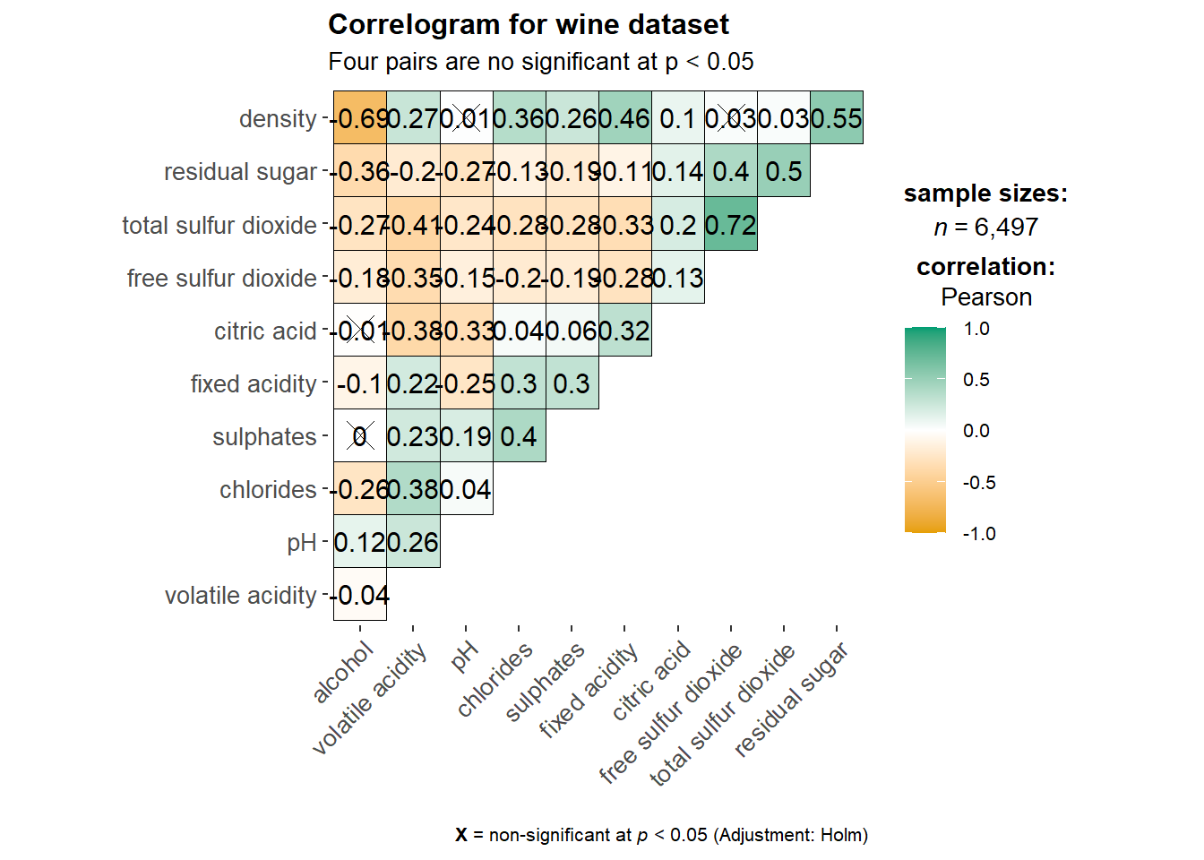
We can further customise the correlation matrix by adding additional arguments and also include title and subtitle!
ggcorrmat(
  data = wine,
  cor.vars = 1:11,
  ggcorrplot.args = list(outline.color = "black",
                         hc.order = TRUE,
                         tl.cex = 10),
  title    = "Correlogram for wine dataset",
  subtitle = "Four pairs are no significant at p < 0.05"
)
cor.vars: List of variables for which the correlation matrix is to be computed and visualized. If NULL (default), all numeric variables from data will be used.
gcorrplot.args: A list of additional (mostly aesthetic) arguments that will be passed to ggcorrplot::ggcorrplot() function. The list should avoid any of the following arguments since they are already internally being used: corr, method, p.mat, sig.level, ggtheme, colors, lab, pch, legend.title, digits.
To control specific components of the plot such as the font size of x-axis, y-axis and the statistical report, we can add the following code:
ggcorrmat(
  data = wine,
  cor.vars = 1:11,
  ggcorrplot.args = list(outline.color = "black",
                         hc.order = TRUE,
                         tl.cex = 10),
  title    = "Correlogram for wine dataset",
  subtitle = "Four pairs are no significant at p < 0.05",
  ggplot.component = list(
    theme(text=element_text(size=7),
      axis.text.x = element_text(size = 8),
axis.text.y = element_text(size = 8)))) 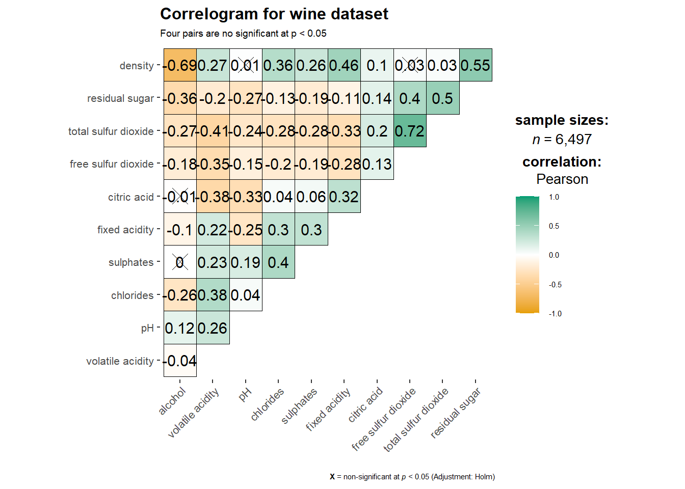
Notice that the font size of the axes are smaller now.
To build facetted correlation matrix, we have to use grouped_ggcorrmat() of gstatsplot instead.
grouped_ggcorrmat(
  data = wine,
  cor.vars = 1:11,
  grouping.var = type, # to have a plot for red wines and another plot for white wines
  type = "robust",
  p.adjust.method = "holm",
  plotgrid.args = list(ncol = 2),
  ggcorrplot.args = list(outline.color = "black",
                         hc.order = TRUE,
                         tl.cex = 10),
  annotation.args = list(
    tag_levels = "a",
    title = "Correlogram for wine dataset",
    subtitle = "The measures are: alcohol, sulphates, fixed acidity, citric acid, chlorides, residual sugar, density, free sulfur dioxide and volatile acidity",
    caption = "Dataset: UCI Machine Learning Repository"
  )
)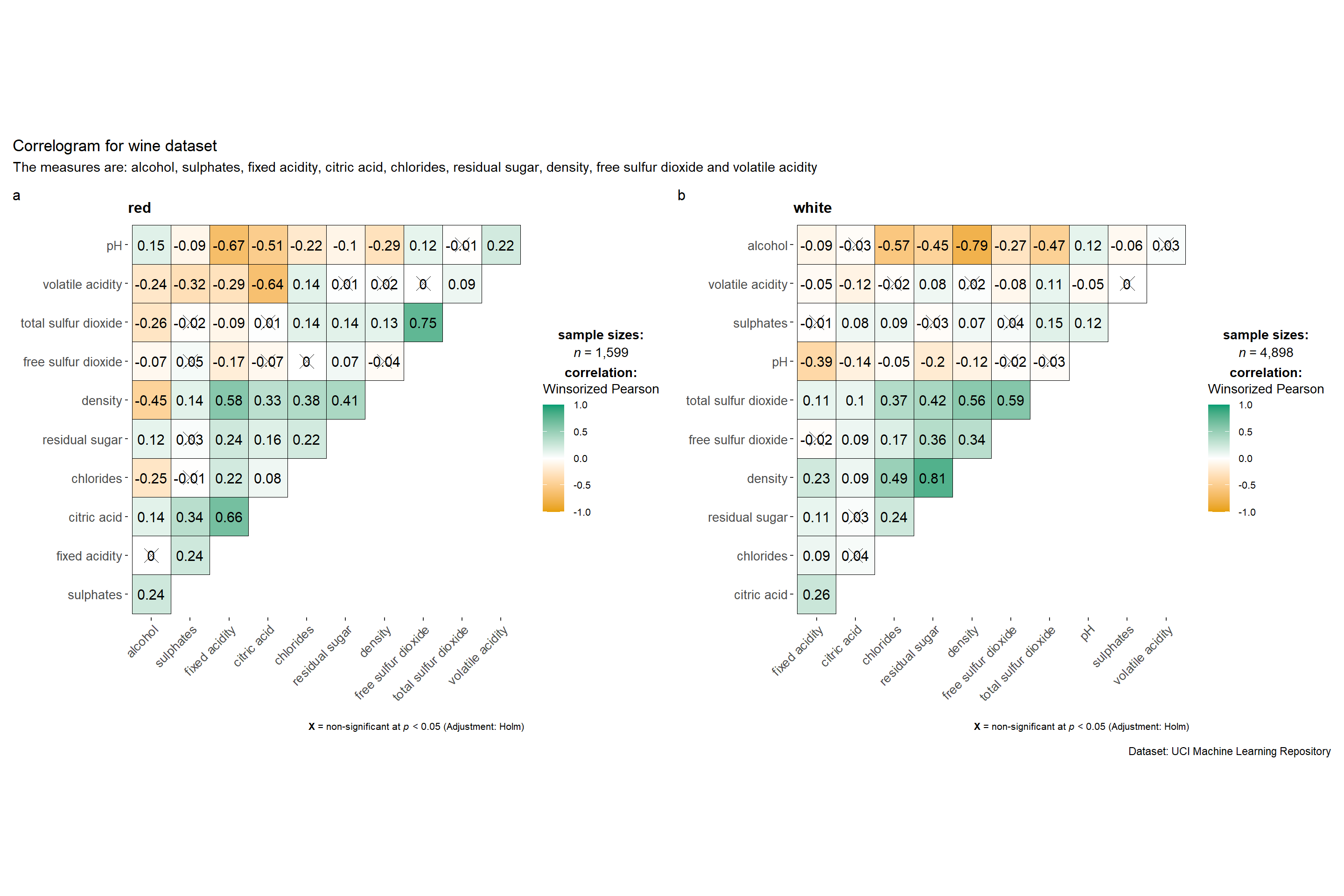
To build a facet plot, the only argument needed is grouping.var.
Behind group_ggcorrmat(), patchwork package is used to create the multiplot. plotgrid.args argument provides a list of additional arguments passed to patchwork::wrap_plots, except for guides argument which is already separately specified earlier.
Likewise, annotation.args argument is calling plot annotation arguments of patchwork package.
Before we plot a corrgram using corrplot() of corrplot package we compute the correlation matrix of the wine data frame using the following code chunk.
wine.cor <- cor(wine2)Then we will use corrplot() and the correlation matrix computed above to plot the corrgram. As a start, we will use all the default settings of corrplot().
corrplot(wine.cor)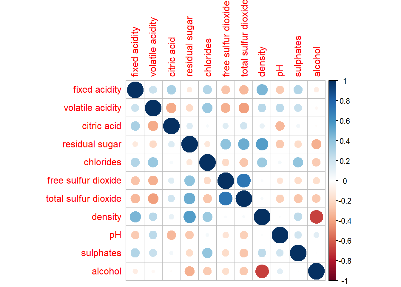
:::{.callout-note appearance = “simple”}
:::
In corrplot package, there are seven visual geometrics (parameter method) can be used to encode the attribute values. They are: circle, square, ellipse, number, shade, color and pie. The default is circle. However, this default setting can be changed by using the method argument as shown in the code chunk below.
corrplot(wine.cor,
method = "ellipse") 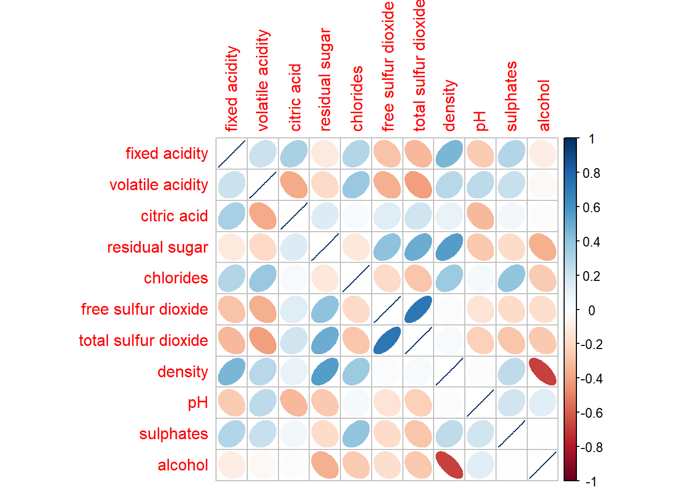
corrplot(wine.cor,
method = "shade") 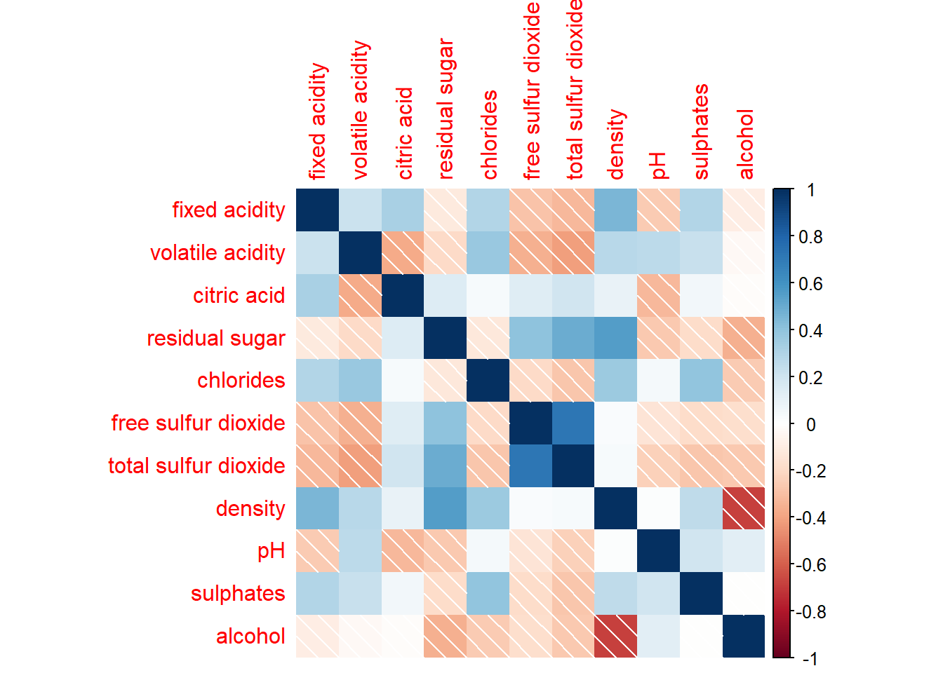
corrplot(wine.cor,
method = "square") 
corrplot(wine.cor,
method = "number") 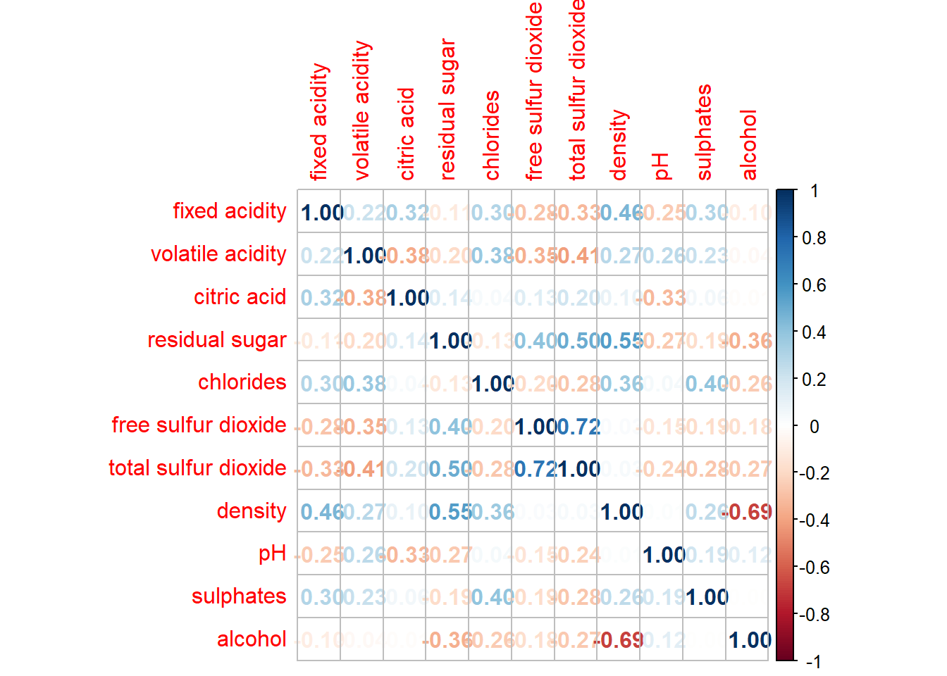
corrplot(wine.cor,
method = "color") 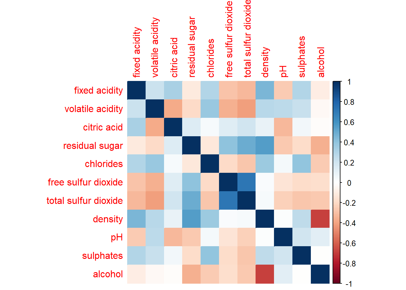
corrplot(wine.cor,
method = "pie") 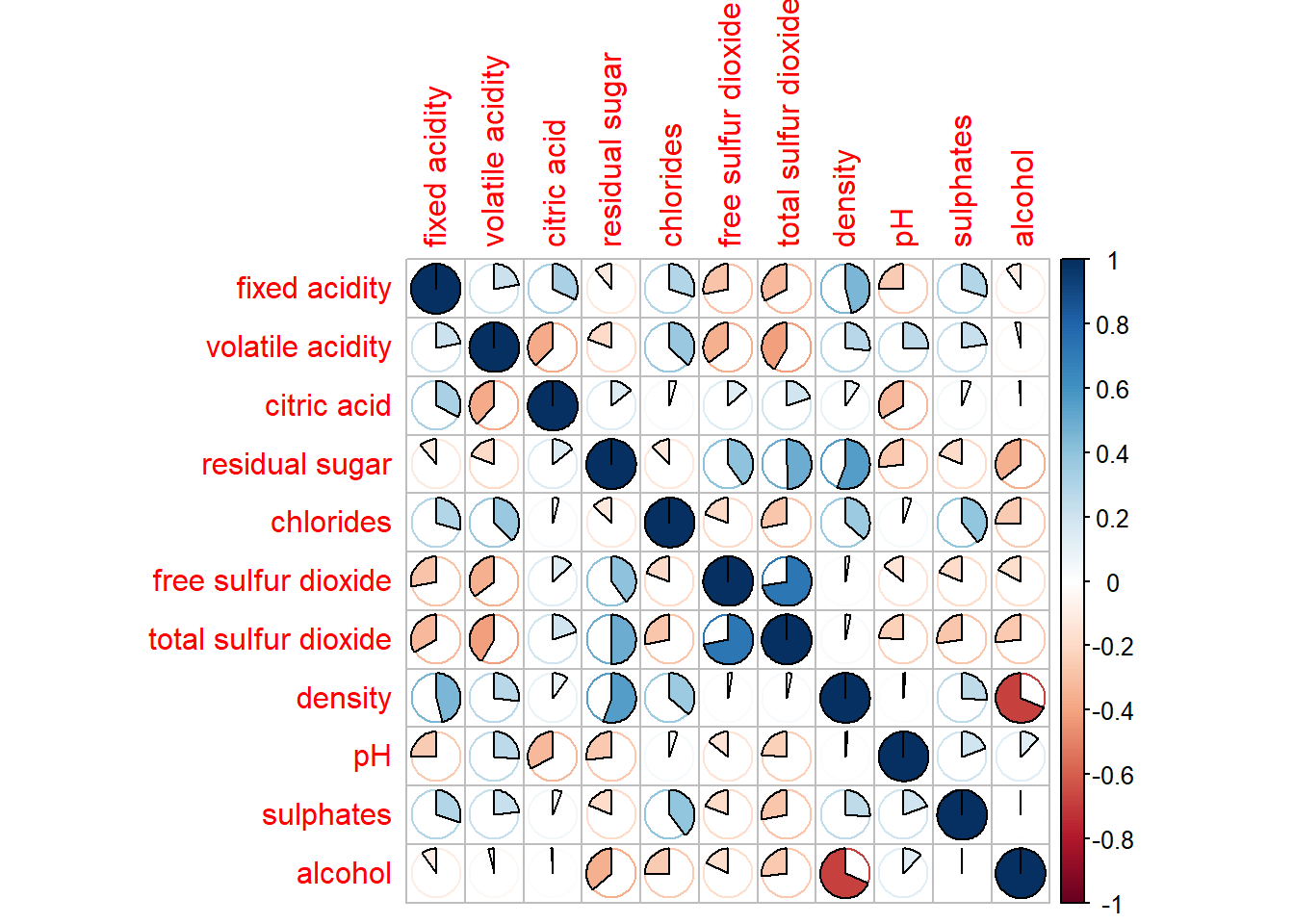
corrplor() supports three layout types, namely: “full”, “upper” or “lower”. The default is “full” which display full matrix. The default setting can be changed by using the type argument of corrplot().
corrplot(wine.cor,
         method = "number",
         type="upper")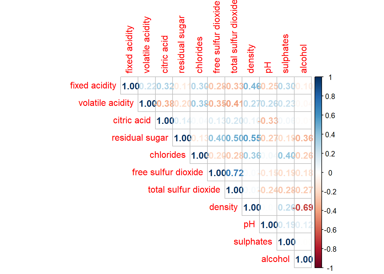
corrplot(wine.cor,
         method = "number",
         type="lower")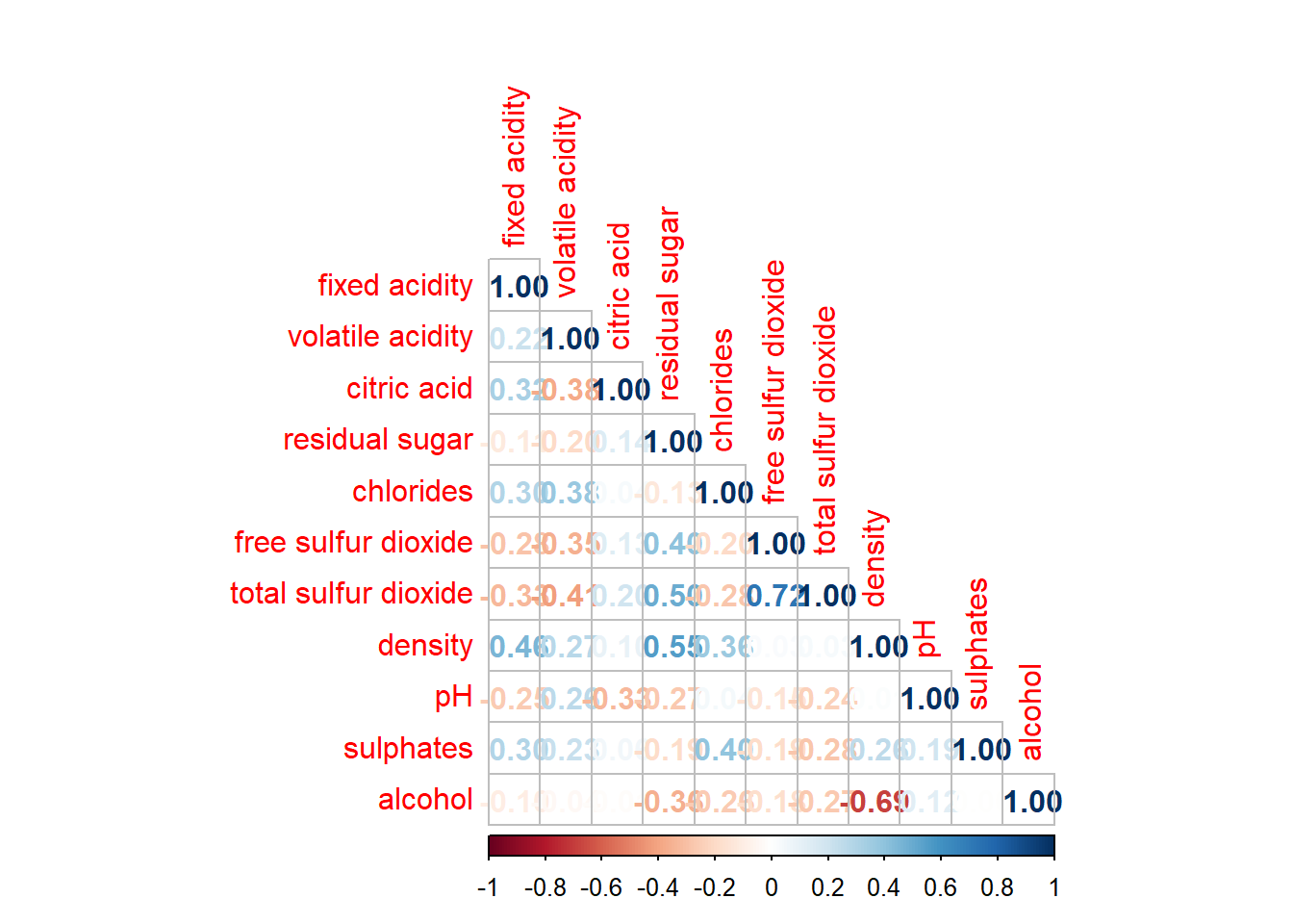
The default layout of the corrgram can be further customised. For example, arguments diag and tl.col are used to turn off the diagonal cells and to change the axis text label colour to black colour respectively as shown in the code chunk and figure below.
corrplot(wine.cor,
         method = "square",
         type="lower",
         diag = FALSE,
         tl.col = "black")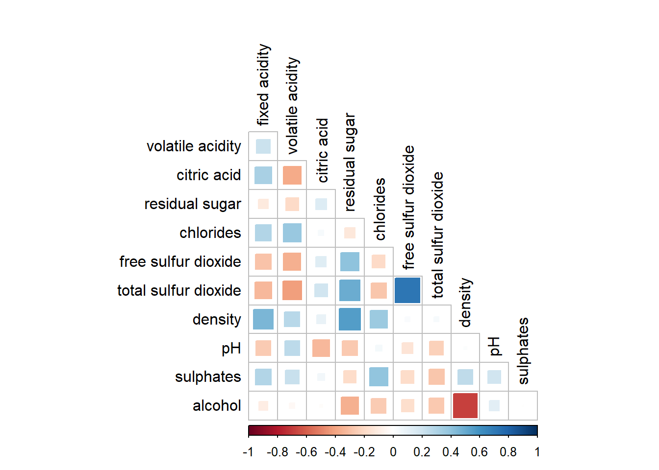
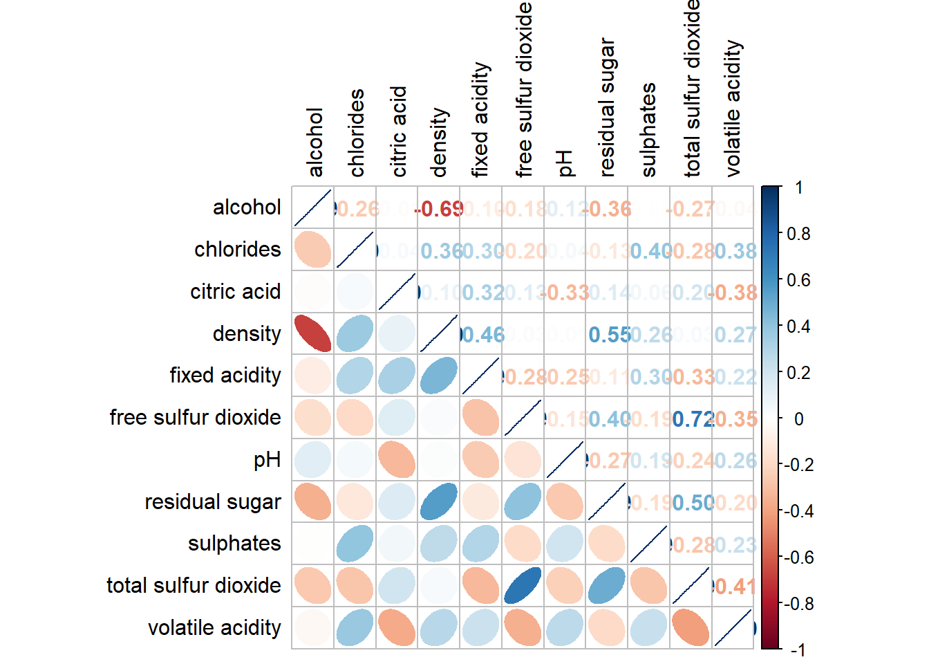
It is possible to design corrgram with mixed visual matrix of one half and numerical matrix on the other half. In order to create a coorgram with mixed layout, the corrplot.mixed(), a wrapped function for mixed visualisation style will be used.
corrplot.mixed(wine.cor,
               lower = "ellipse",
               upper = "number",
               tl.pos = "lt",
               diag = "l",
               tl.col = "black")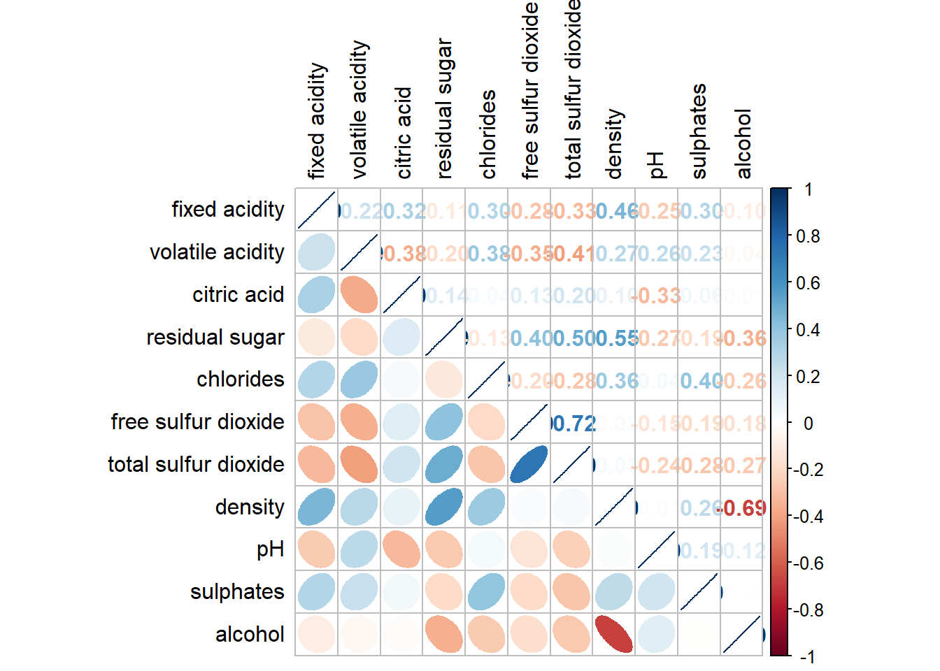
Notice that argument lower and upper are used to define the visualisation method used. In this case ellipse is used to map the lower half of the corrgram and numerical matrix (i.e. number) is used to map the upper half of the corrgram. The argument tl.pos, on the other, is used to specify the placement of the axis label. Lastly, the diag argument is used to specify the glyph on the principal diagonal of the corrgram.
In statistical analysis, we are also interested to know which pair of variables their correlation coefficients are statistically significant.
With corrplot package, we can combine corrgram with significance test. First, we use the cor.mtest() to compute the p-values and confidence interval for each pair of variables.
wine.sig <- cor.mtest(wine.cor, conf.level=0.95)We then use the p.mat argument of corrplot function as shown below.
corrplot(wine.cor,
         method = "number",
         type = "lower",
         diag = FALSE,
         tl.col = "black",
         tl.srt = 45,
         p.mat = wine.sig$p,
         sig.level = .05)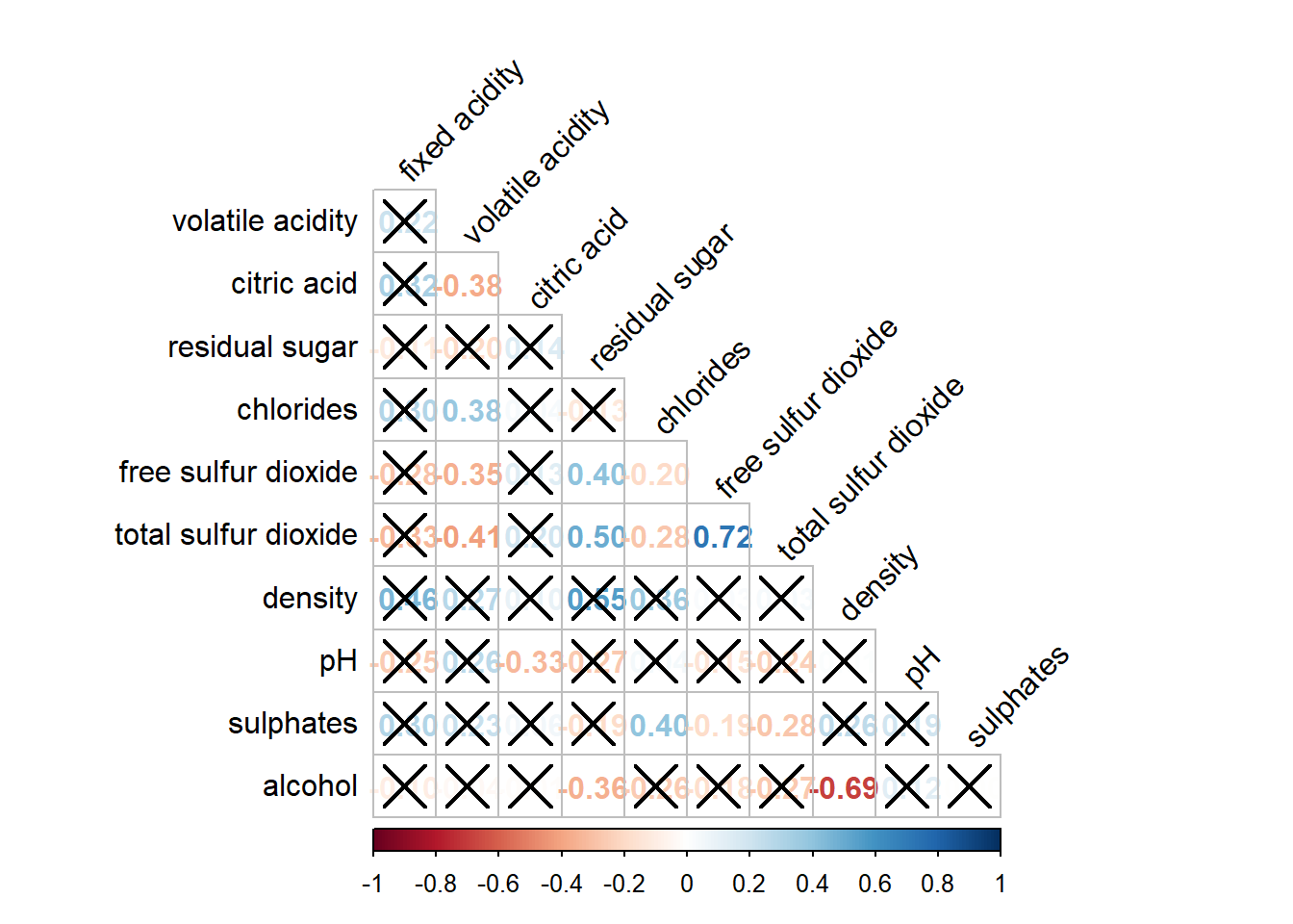
The corrgram reveals that not all correlation pairs are statistically significant. For example the correlation between total sulfur dioxide and free surfur dioxide is statistically significant at significant level of 0.05 but not the pair between total sulfur dioxide and citric acid.
Matrix reorder is important for mining the hiden structure and pattern in a corrgram. By default, the order of attributes of a corrgram is sorted according to the correlation matrix (i.e. “original”). The default setting can be over-write by using the order argument of corrplot(). Currently, corrplot package support four sorting methods, they are:
“AOE”, “FPC”, “hclust”, “alphabet”. More algorithms can be found in seriation package.
corrplot.mixed(wine.cor,
               lower = "ellipse",
               upper = "number",
               tl.pos = "lt",
               diag = "l",
               order="AOE",
               tl.col = "black")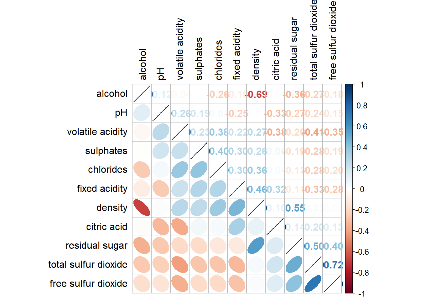
corrplot.mixed(wine.cor,
               lower = "ellipse",
               upper = "number",
               tl.pos = "lt",
               diag = "l",
               order="FPC",
               tl.col = "black")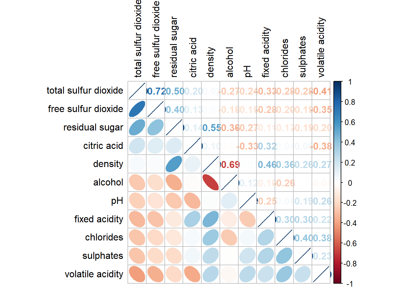
corrplot.mixed(wine.cor,
               lower = "ellipse",
               upper = "number",
               tl.pos = "lt",
               diag = "l",
               order="hclust",
               hclust.method= "ward.D",
               tl.col = "black")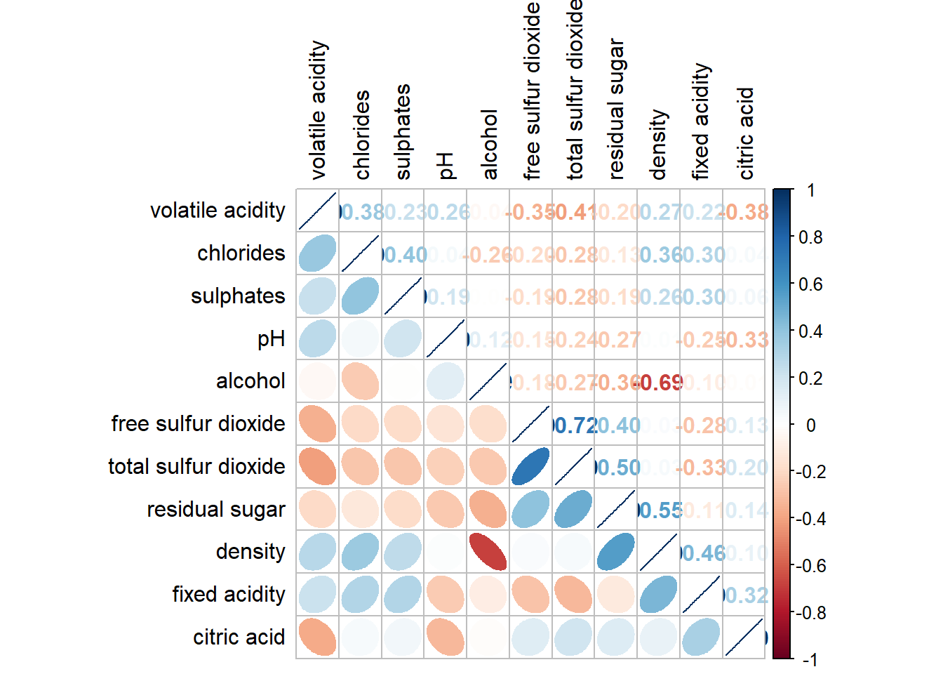
corrplot.mixed(wine.cor,
               lower = "ellipse",
               upper = "number",
               tl.pos = "lt",
               diag = "l",
               order="alphabet",
               tl.col = "black")